Unfilter (go back to News, Awards, Writing and Ideas webpage)
Filter entries:
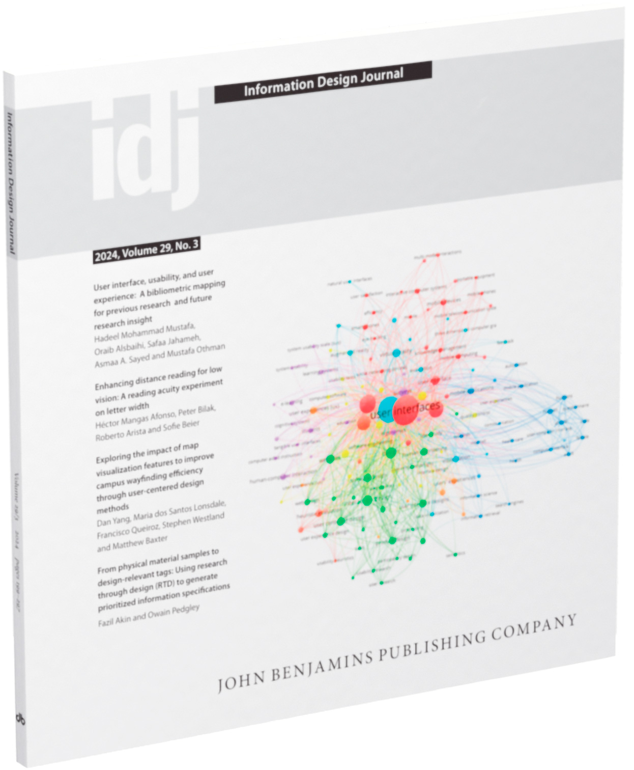
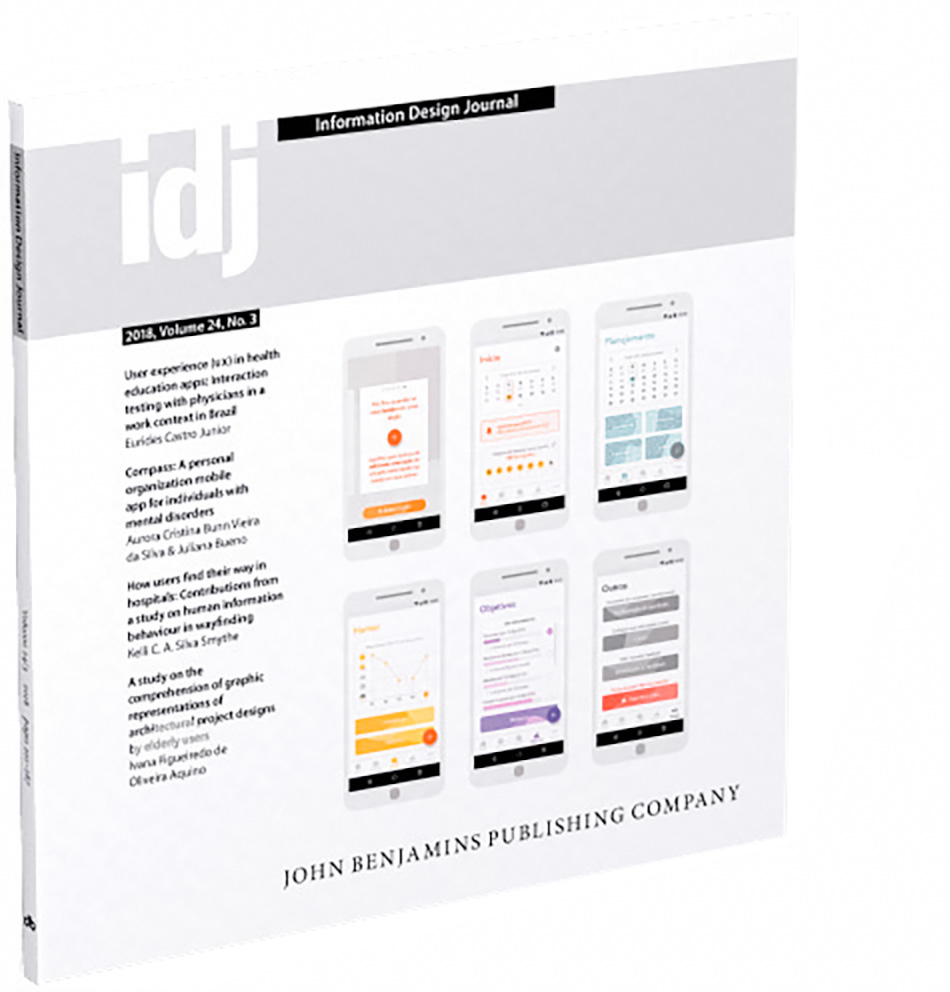
Design for People book review
Our book review of Scott Stowell’s book Design for People has been published in the Information Design Journal, 29(3), 2024. November 2025.
New article Observations on the New Graphic Design 1958–1965 Journals by Josef Müller-Brockmann, Richard P. Lohse, Hans Neuburg and Carlo Vivarelli (And Others)
Our monstrous full length journal review titled Observations on the New Graphic Design 1958–1965 journals by Josef Müller-Brockmann, Richard P. Lohse, Hans Neuburg and Carlo Vivarelli (And Others) is available to read on our Medium. July 2025.
There is also a very short post about it on our Behance, and if you liked that check out our The Best Dutch Book Designs 2017 book review. July 2025.
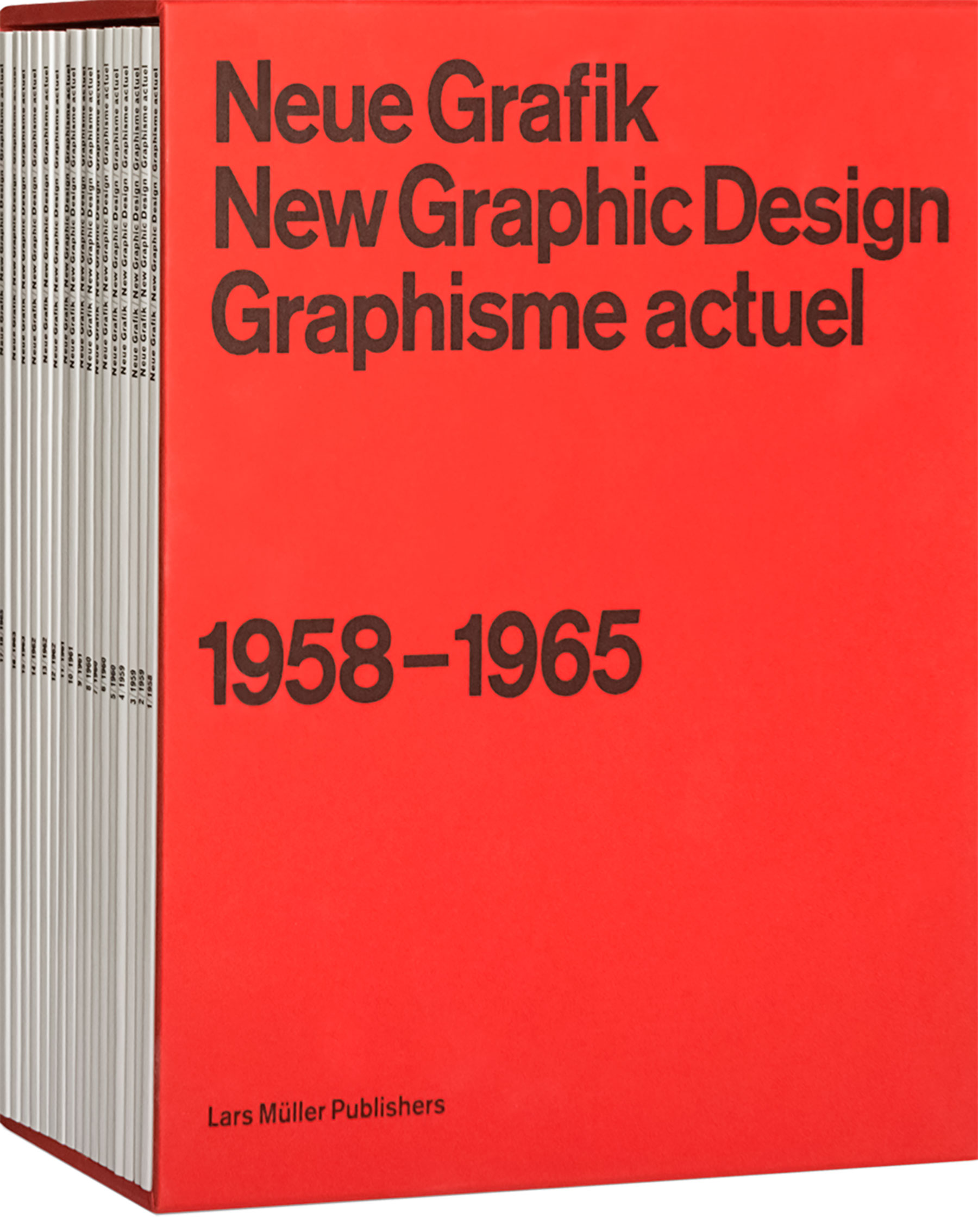
New article Observations on the New Graphic Design 1958–1965 Journals by Josef Müller-Brockmann, Richard P. Lohse, Hans Neuburg and Carlo Vivarelli (And Others)
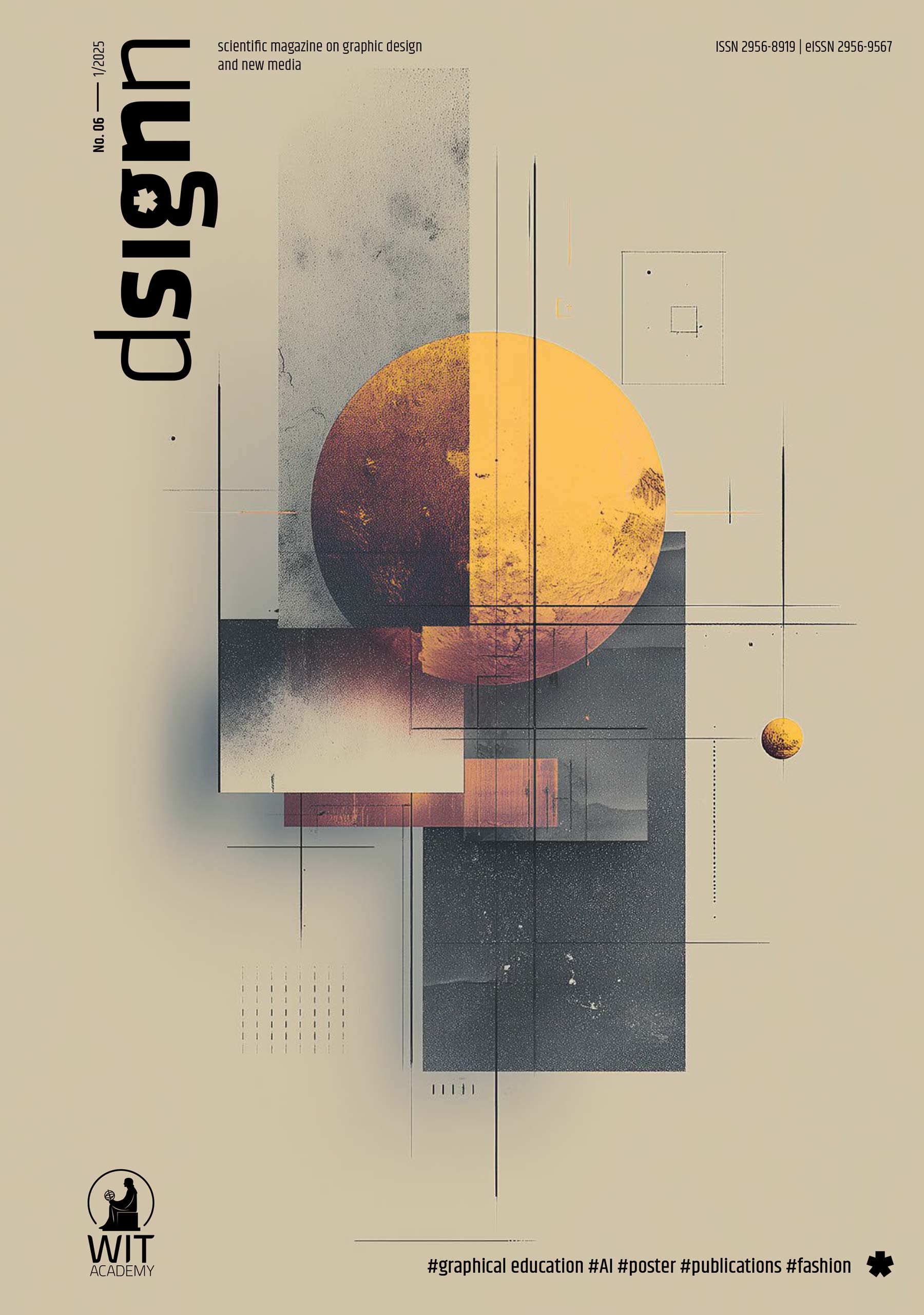
A short version of our monstrous journal review titled Observations on the New Graphic Design 1958–1965 Journals by Josef Müller-Brockmann, Richard P. Lohse, Hans Neuburg and Carlo Vivarelli (And Others), has been published by the Polish scientific magazine on graphic design and new media, dsignn. The review is on pages 76–83 of the PDF, of issue 6, 2025. The full version will be available soon. June 2025.
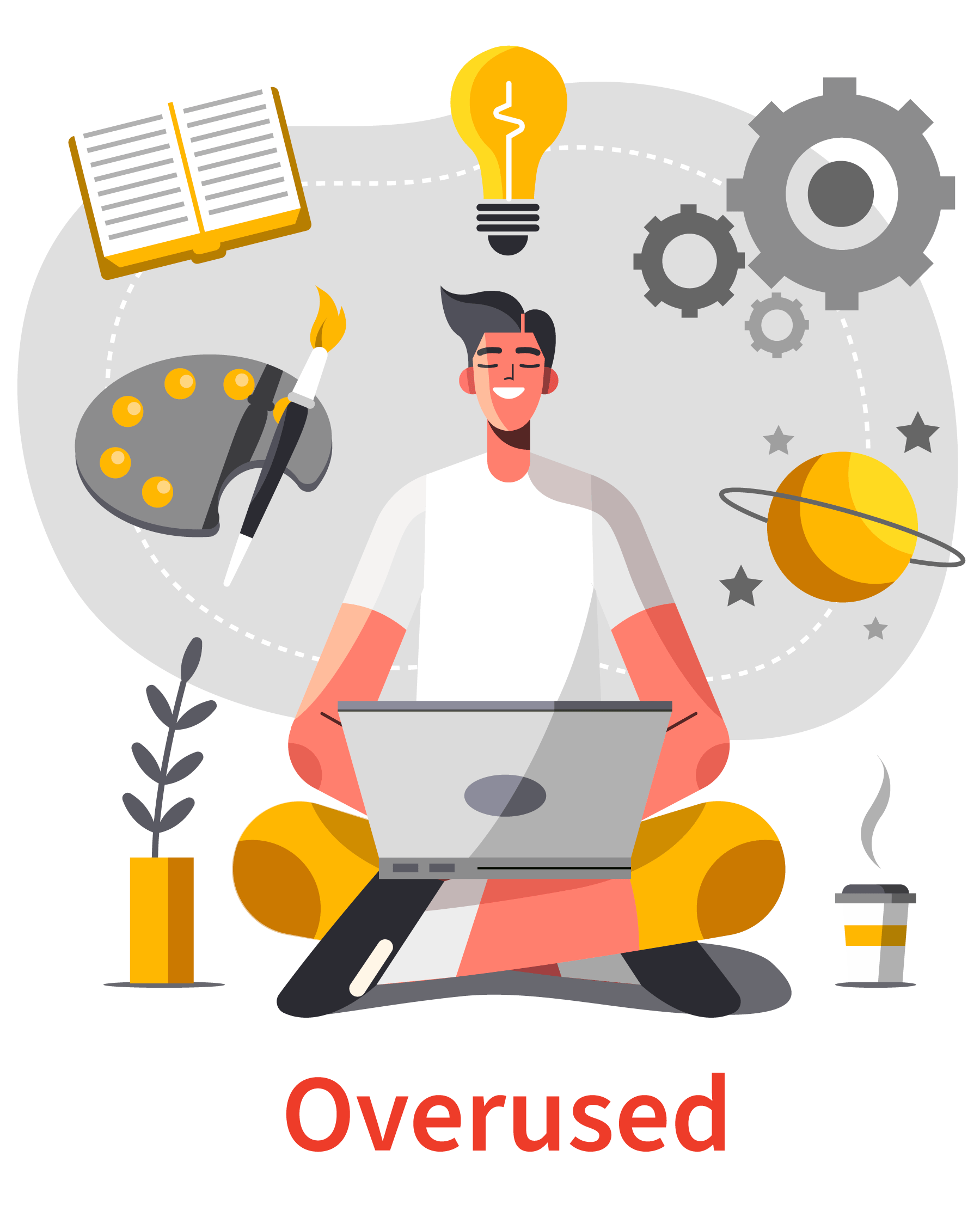
New article The Role of Illustration Style in Visual Storytelling
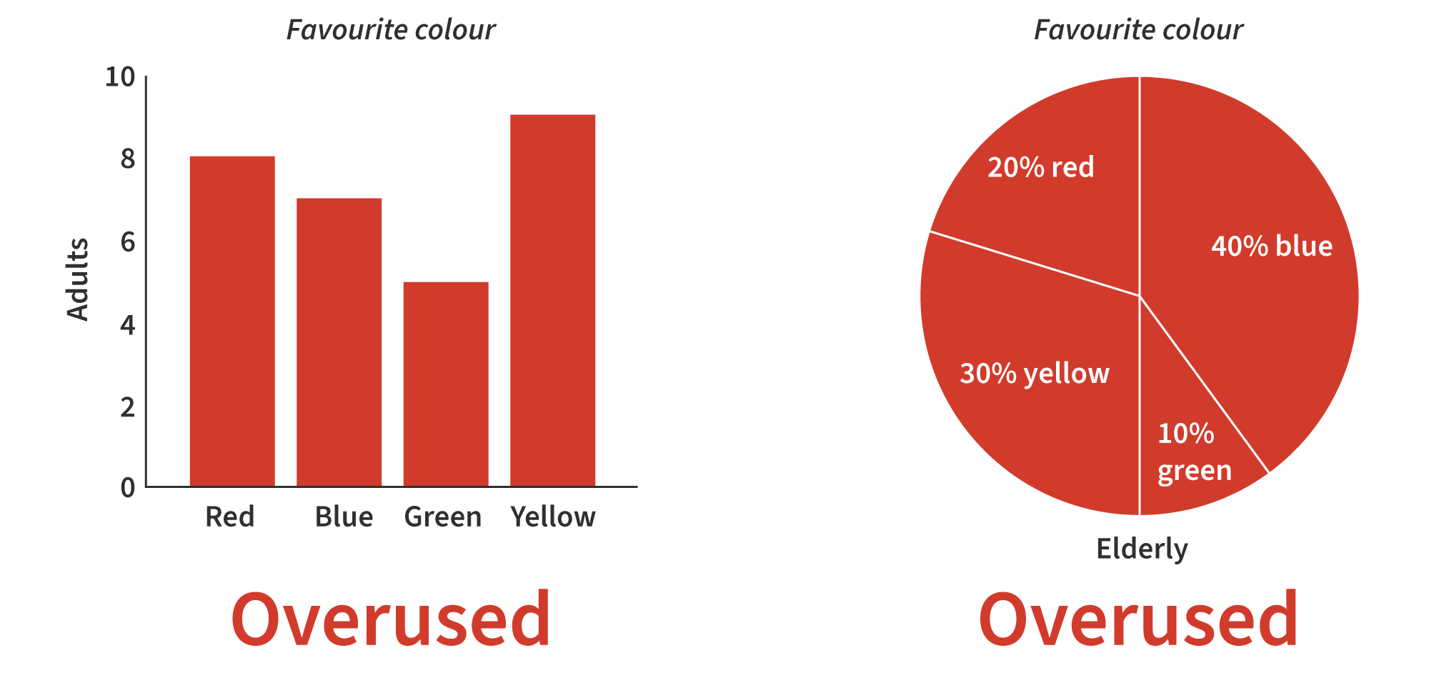
We have written a new article titled The Role of Illustration Style in Visual Storytelling. Flat clean vector illustration is so overused (as is shown). Thanks to Yana Kirilenko and Alma Hoffmann. January 2025.
New article Alternatives to Typical Technical Illustrations and Data Visualisations
We have written a new article titled Alternatives to Typical Technical Illustrations and Data Visualisations. Bar and pie charts are so overused (as is shown). Thanks to Yana Kirilenko. November 2024.
‘We All Have Our Little Things…’ (Liz) […] paper
We should not be scared to tackle and discuss the more delicate and tricky issues of society and of human living… But it is not always easy… Yes difficult issues come with a certain amount of not knowing, fear, and wasted energy (but that is what the problem is in the 1st place).
Read our paper ‘We All Have Our Little Things…’ (Liz) and Our Art of Health Global Competition Entry for STI & HIV 2023 on our Medium. About us trying to do more edgy, difficult and challenging design projects, as well as still offering our range of other services. Zbohom (goodbye in Slovakian). April 2024.

Effectiveness request of the awarded redesigned disability pictogram winning entry…
In December 2023, we got an email from The International Union of Architects (UIA) and Rehabilitation International (RI) who jointly invited submissions in 2022, for a 21st-century symbol of accessibility, to represent their core values of rights and inclusion, independence, physical and virtual accessibility for all, including people with disabilities. The intent was for the new symbol from the competition, to replace the person in a wheelchair pictogram.
So in May 2022, we submitted a design along with user testing results. After a delay of 3 weeks after the original winners’ announcement date, we were not successful, our submission did not get an award. We said the following about the top-3 pictogram designs awarded ‘not good’. We were not keen on the awarded design and did not know what it was…
So in December 2023, we got an email from them once again saying ‘It is important to note that whilst this new symbol has been proposed to the Public Information Symbols, Signs and Guidance System (ISO/TC 145/SC1) (International Organisation for Standardisation, 1970) documentation, it has not yet been accepted and the views of key stakeholders, are being invited on this important issue. To that extent the Guild of Architectural Ironmongers (GAI) and Graphical Symbols – Public Information Symbols (PH/8/2) (The British Standards Institution, 2023) documentation, would like to ascertain the thoughts of industry, by requesting responses to the following questions’. We will save you the work of reading the 13 electronic form questions about the new amazing pictogram design. But they are very unsure about the design itself, and are not sure if it even works or is good… So I think I have said enough, I replied to the form, and at the end I wrote ‘why not use our design that we submitted and read the user testing results?’. Anyway, I think you get the idea. If you employ people who do not really know what they are doing, it never goes very well and is more open to problems (people have known this for 100s of years).
Competition board
The competition board cannot be told either (they think they know best and know better than designers or users). In fact, this is not even the point, the point is if a large range of people, like, can use, and can understand the new symbol. The competition board show a lack of intelligence, and they will not have their information and beliefs contested, maybe they enjoyed judging the competition so much, that they want to do it all over again? But there is no need, as they have our entry and many other good ones… When someone cannot be told, they might not like what they hear, or they might disagree, this may be the case, but if you cannot be told, you do not learn anything, or possibly know about something you might be doing wrong, or could be done better. The competition board chose a design based on their subjective preferences, it gives them a sense of input and value, but the mistake is they usually have no expertise in the area and they only choose to reinforce and value their singular narrow vision, but the new pictogram will be used by millions of people. Maybe they simply disagree from their comfortable and luxurious position, maybe their disagreeing, is the incontestable de facto that should never be looked at and simply is… but it would seem not now. Maybe they are scared of an alternative to their grand subjective personal incontestable utopian ideologies. If only they were given a disability or put in the position of a person with disabilities, stripped of their goods, wealth, position and supplies, only when it becomes a reality, are they denied their indestructible castle with a moat. They expect change, insist on change, they demand change, they think they have a right to change, they want a say and to direct constitutional reform, but unfortunately and there is an almighty unfortunately… they will not have their own constitution reformed (oh no, and most certainly not, how could it possibly be wrong and have faults…). They promote, but they do not do what they promote. There are even some that do all that is asked and required, but that have their value robbed and misdirected… and this is 1 of the worst ones out there, but it happens more than you might think, but they will not always tell you. It all becomes very silly, until in the end, you find out what really matters, power and value. The person who has the power and value, survives, at least in a Western society anyway. The people with power and value are also stronger, by default than people with less power and value… The underdog has already started difficultly with an increased amount of failure from the start, on their utopian quest, of an unknown size (but maybe that is what the people with power and value really wanted in the 1st place, but did not reveal).
We ourselves do enjoy the view from ground level, free to go wherever but not without a certain amount of automatic problems. But a castle with a moat, would be a nice objective reality. Then we could fire-off a few cannonballs and delete some of our problems, without being burnt or hit, hopefully destroying some of the bozo corporations. Anyway, it is all fairly typical stuff, and we are certainly not surprised. But it does become a little degressive year-after-year.
This scenario reminds us of our old, and he would not mind, Australian colleague David Sless, director of the Communication Research Institute. We wonder what he would say, although he probably has many copies from years and decades gone by, but probably enjoys fig rolls and cigars more these days in the hot sunshine.
So we have done our bit (and free of financial charge, for goodwill and public good) and that is it. We were not surprised at the concerned request for information about the effectiveness of the newly awarded pictogram, but it does insult and devalue our work. Charlotte Armstrong in 2023, in her article Replacing the Accessibility Symbol – What Is Happening and How to Get Involved (Armstrong, 2023) has also arrived at the same grand discovery.
Few knowns in communication, but it does not mean we should not try to find out, and there are many ways of doing so, massively developed in the last 10–20 years. We must never assume communication or more specifically graphic communication will go well, as is expected or intended, it is a very faulty belief. And when you add political difficulty to the equation, you might as well put your sprinting shoes on.
The surprising thing is, that we still cannot work out, is how they arrived at a very bad awarded pictogram. That they then need more information on, because it is so highly unusable and unsuccessful. They have had 100s of entries including ours, all with the required user testing data (naturally), and they still do not have something that works and can be used… We do not understand it and is highly frustrating, stupid and insulting to human intelligence. Should we have even bothered.
And there is another issue that has been genuinely overlooked but that should not. The final awarded winning new pictogram design, has to be submitted to the International Organisation for Standardisation (ISO)… so they do not even know for sure, if the winning pictogram design will be accepted… This is a difficult area and we are not blaming them about this issue, but maybe they could have submitted some designs, like 3 designs to the International Organisation for Standardisation (ISO), then at least there should be something half usable for them to do something with?
The newly awarded pictogram design in 2022 by Ukrainian architect Maksym Holovkoas, to replace the person in a wheelchair pictogram.

Find out more about our competition entry, on our Information Design webpage. February 2023.
References
- International Organisation for Standardisation (ISO). (1970). ISO/TC 145/SC 1, Public information symbols, signs and guidance system. https://www.iso.org/committee/52662.html.
- The British Standards Institution. (2023). PH/8/2 – Graphical Symbols – Public Information Symbols. https://standardsdevelopment.bsigroup.com/committees/50002556.
- Armstrong, C. (2023). Replacing the accessibility symbol – what is happening and how to get involved. Locksmith Journal. https://www.locksmithjournal.co.uk/replacing-accessibility-symbol-happening-get-involved.
Photographing books… with Justina Nekrašaitė (The Book Photographer) from Amsterdam
So many problems today, maybe even more than in previous years. But never has there been so many opportunities and solutions… But they rarely get to where they need to. To speak to someone or people, who listen, consider, value and ask about what you are saying and doing, is a very rare thing these days.
Here at User Design, Illustration and Typesetting we are focused on delivering solutions every day of the working week, we have to listen to the client, read the brief, solve problems, decide upon ultimate solutions, speak to people involved, deliver and implement solutions, find out if users are okay and if things work well, if they have had a good user experience. And we also have to check if there is enough money in our pockets, so we can do the things we need to. We try not to reject what people say, we try not to assume, we try not to implement mandatory forced solutions, and here is the big 1, we try to always run things by our clients, to ask, to show, to tell, to explain, to discuss, to debate (and we are not going to tell you why we do this). David Sless, director of the Communication Research Institute says:
‘Out of this work, we are creating the tools and methods for a new design profession, which is displacing traditional graphic design and its concern for physical presence. The new profession of information designers transcends the physical and goes to the heart of the functional information needs of an organisation, creating powerful systems that simultaneously shape whole classes of information for workers, consumers and citizens. As a profession, information designers are driven by a desire to make information accessible and usable to ordinary people, and their work lends a quiet dignity to the objects of ordinary life.
It is my firm conviction that we need to stimulate the growth of this profession of information designers if we are to ensure that information becomes something of value in our society, and not a burden’ (Sless, 1995).
And the important part that I would like to requote, is a designer’s ‘work lends a quiet dignity to the objects of ordinary life’. Sounds boring and bland, does it not?, however very desirable for everyday efficient functioning, and when a designer’s work does not lend to a ‘quiet dignity to the objects of ordinary life’, you will sure as hell notice it and know about it (it has another name dysfunction).
Customer service at physical banks in the United Kingdom
We went to a physical bank last week, and we went to the 1st account machine, put our card in, typed in the number, went to print a statement, pressed print, only to be told by the machine, that it was out of paper… A few minutes earlier, I had to cycle all the way across Leicester city, because the original bank I wanted to go to (same banking branch), had shut down in the last month (even though it said it was open, on the Google search side panel opening times information). Luckily and thankfully, the 2nd account machine (there are 3 side‑by‑side in the physical bank), had paper in… Standing behind me, were 3 of the bank’s staff with iPads in their hands. They cannot even check if a machine has paper in it. There could have been a long queue on the other machines. So maybe there is a divine being out there. Maybe the mass media and large corporations have got it right, maybe we should do away with physical shops, as customer service, is not what it used to be. In countries like Switzerland and Germany, if bad customer service happens, the offender gets a really bad look and frown, with possible loss of life (in a manner of speaking, of course). Yes I am not kidding, these countries do not tolerate it. In the hotel and sommelier industry, customer service is serious business. Anyway, onto the point of our news post.
Photographing books
We have photographed most of the printed books on our website, although it is quite a difficult and tricky task. If you are an amateur or even intermediate, or do not have the right equipment, it can be a difficult and time‑consuming task, as we have found out over the years. In fact, it is more work than you might think. Light, getting the book flat, focus sharpness, shadows, and getting the correct colour and exposure, are massively time-consuming and difficult tasks. To do it well, you need your own known setup that works. And on more than 1 of our photographing book projects, we have had to completely reshoot, because we have got photographs (that we think are good and correct) back into the computer, then started to go through them, to realise they are not quite right, and need reshooting, all over again. That is right, on more than 1 occasion, we have had to reshoot projects. When you photograph books, the colour contrast is quite narrow (thin), because of this, you need to get it even more correct and how it should be, and done inside the camera (top tip!).
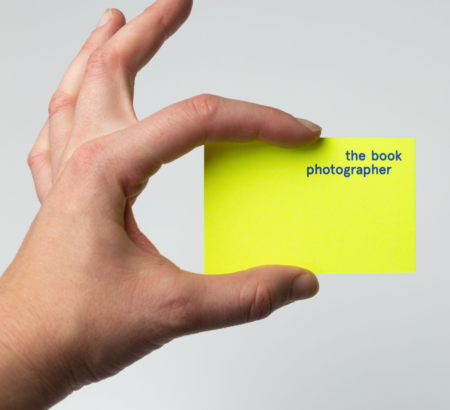
© Justina Nekrašaitė (The Book Photographer), view her portfolio website, Instagram and LinkedIn.
Photograph from photoshoot © Justina Nekrašaitė (The Book Photographer), view her portfolio website, Instagram and LinkedIn.
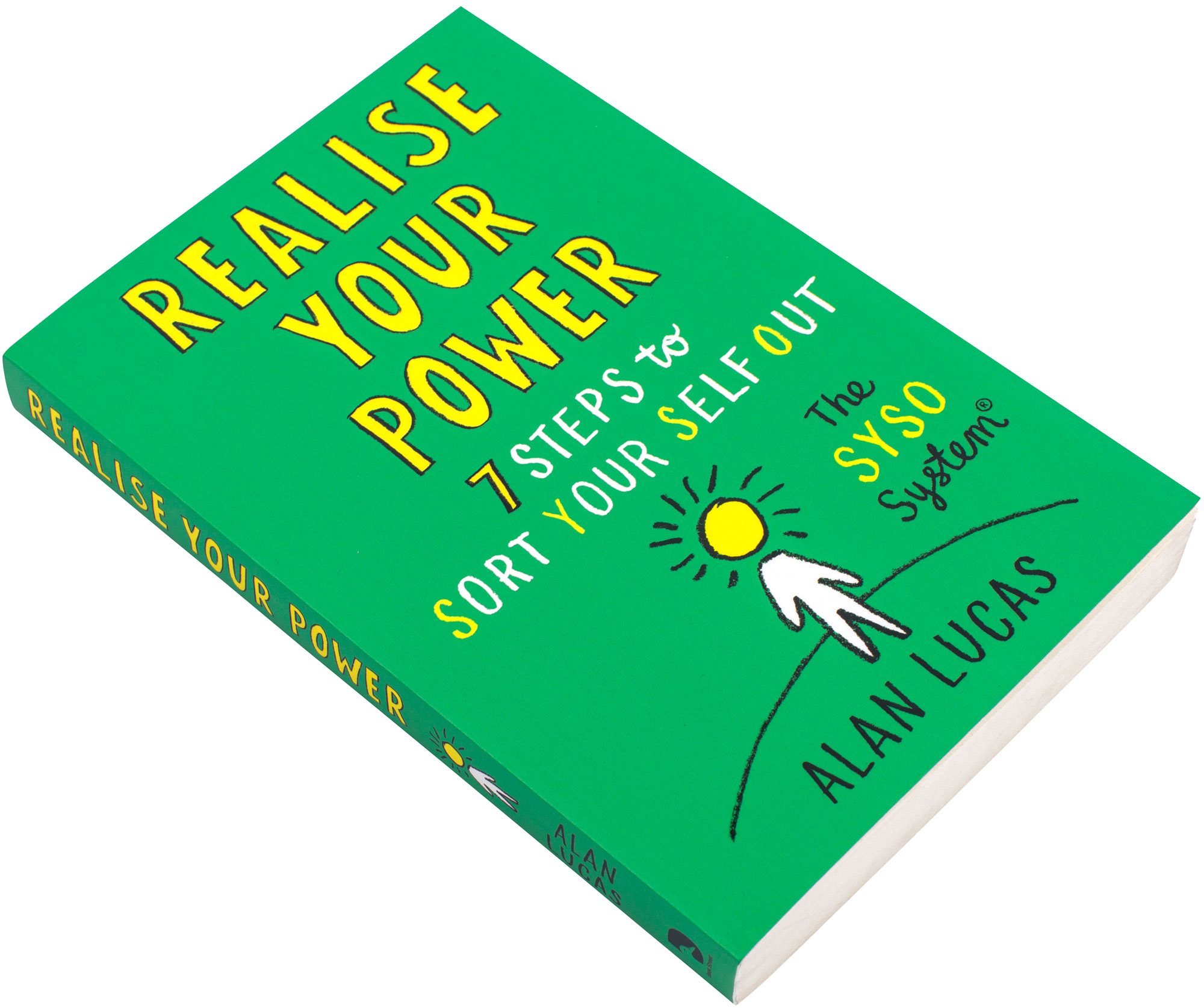
We worked on the book design, illustration, typesetting and amending editorial corrections of Alan Lucas’s Realise Your Power (Lucas, 2023) book, published in 2023 by Whitefox, that went really really well (in fact better than well, we are delighted with the end results). The book is essentially a standard paperback book, as seen in bookshops, and helps you ‘sort your self out’, get motivated, find possibilities and make progress. Some people say they do not like self help books. Well… the bottom line is that they help people, people get something from it. I would say that is that. The cover paper is nice and supports the book, the paper grain of the inside paper actually goes in the right direction (vertically up and down the book’s spine), our design is very unusual in the sense that it was accepted and approved (it has a very nice fun feel and is easy-to-use). The book was printed by Clays, Suffolk, United Kingdom, Elograf, S.p.A.
The problems around photographing books
We thought about photographing the book ourselves, it is more tricky than usual, because of the book’s smallish pocket-size. The issue is getting the outer edge of the spreads to lie flat, and not fold back in and shut the open book. It does this mainly because of the hot‑melt glue (Kinross, 2007) (perfect) binding, that glues the pages (left side of the book block) onto the spin, to near concrete strength. So, 1 of the things that you have to do, is slightly flatten the open spread, then get some special sellotape that peels off easily, so it does not stick harshly to the paper (that would then rip when you pull it off), to make the outer edge pages stick to the table. So you can photography the pages flat (well as near flat as you can get, and yes it does sound complex and difficult, and that is because it is). I am even tired now describing this, and we have not even started to photograph the pages… Larger art, architecture and design books, are easier to photograph, because the page size is larger, that allow double page spreads to open flatter. These types of books, typically use less ridged binding than holt-melt glue, or they are hardback sewn bound, or they use a binding method such as otabinding.
So to cut a long story (and job) short! … … … we found out about Justina Nekrašaitė (The Book Photographer) based in Amsterdam a few years ago, from the Best Dutch Book Design competition yearly annual, and we really liked what she was doing. We had a meeting with her on the 5 February 2024, then commissioned her to photograph Alan Lucas’s Realise Your Power book, published in 2023 by Whitefox, that we worked on. Interested of course to see the results, and to make our life easier and to free-up time. We booked the project in, paid, arranged a meeting to go through the project brief, chatted a bit, explored issues in our professions and with the project. There is no doubt, this book photography project is a dirty job project, and we were more than happy for Justina Nekrašaitė to sort it out.
Thanks also to Alan Lucas and Whitefox for permission to allow us, to shoot photographs of the book. We will write-up the project and add the other photos soon, and put on them on the Book Design webpage.
Tot ziens (goodbye in Dutch). February 2024.
References
- Kinross, R. (2007). Books that lie open. Hyphen Press. https://hyphenpress.co.uk/books_that_lie_open/.
- Lucas, A. (2023). Realise your power. Whitefox.
- Sless, D. (1995). Information design for the information age. Communication News, 8(5/6).
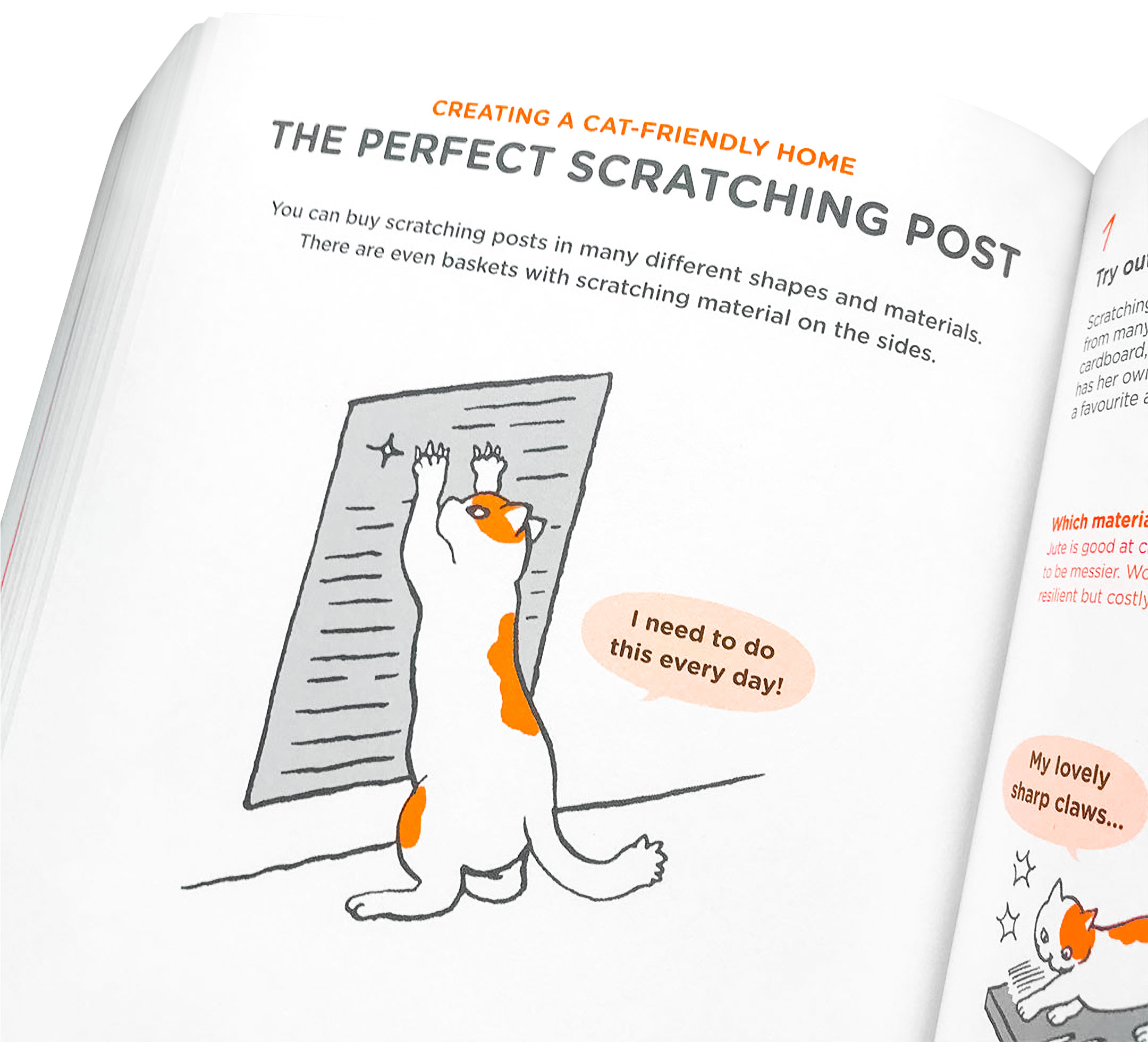
What Cats Want: An Illustrated Guide for Truly Understanding Your Cat project and book review. A 100% (10 out of 10) perfect book
So much dysfunction and bad people in the world, who like to fight and create chaos, who cannot be enlightened and who choose not to value what they hear… What did the musician Bob Marley say ‘let’s get together and feel alright’ (Marley, 1978) and ‘politics is a heavy game man/woman (BBC, 1980), rasclaat!’.
However, and there is a precisely snappy however. Below is an example of effective human collaboration (is it possible, could it possibly be true?). Not an obviously common occurrence these days, but it did occur.
‘The most beautiful and best book we have ever seen designed, in the last 24 years’.
We have had some time to write-up projects recently and do some other interesting things. To find out more, read our project and book review of What Cats Want: An Illustrated Guide for Truly Understanding Your Cat project and book review. A 100% (10 out of 10) perfect book, that we worked on for Bloomsbury publishers in 2020. February 2024.
Our website’s editorial style guide
You can now view our website’s editorial style guide, all for free, that contains loads of good stuff aimed at wide-spread usability and text comprehension. We know that people have very personal, subjective and funny views about editorial style, punctuation and grammar, so it could be of interest for those with a penchant for syntax (forgive the gobbledygook). We hope you find it useful. Any issues or errors, please do contact us. June 2023.
New article Local Independent Bookshop Fox Books in Leicester, United Kingdom, and the Future of Physical Bookshops…
We have researched and written the article Local Independent Bookshop Fox Books in Leicester, United Kingdom, and the Future of Physical Bookshops… that highlights the current environment in 2023 and changing times in the retail sector after Covid‑19, and what they might need to do to butter the bread. We hope it is of some use. March 2023.
![]()
![]()

New article Useful Accessibility and Usability Examples To Help Improve Your Designs
We were asked by the Smashing Magazine team to write another article and produced Useful Accessibility and Usability Examples To Help Improve Your Designs to help designers make their designs more accessible and usable, and to envisage and come-up with new ideas in the areas of accessibility and usability. The easily over-looked area of access structures is discussed, that seems to have been most notably mentioned wayback in 1979 by the information designer Rob Waller, although they rarely get mentioned in current times. The article is for designers on their lunch break and we worked on the tone of the writing more than usual to make it upbeat, lively and increase readers motivation. We have previously explored and discussed tone in writing, in our interview An Interview With Anne-Marie Chisnall From Write on Plain English and Information Design, and as people say tone is a funny thing. Thanks again to Iris Lješnjanin and Yana Kirilenko. December 2022.
Measuring the Performance of Typefaces for Users paper
Often people and designers who use and select typefaces, do so using their personal preference and do not see or forget the larger system. What objectivity can we hope to gain from testing typefaces? The difficult and complex area of testing typefaces, in our paper Measuring the Performance of Typefaces for Users (Part 1) and Measuring the Performance of Typefaces for Users (Part 2) but ‘I think we are there’.
The paper was wrote in about 3 days (quick to write) although Alma Hoffmann (Smashing Magazine editor) pushed us much more, and the paper went through 3 rewrites and 3 reedits (slow to publish) but certainly benefited. Thanks again to Alma Hoffmann and Natalia Lassance.
‘Well, whatever your thoughts are, in 2022, with a mass of typefaces available and 100s of years of designing and manufacturing typefaces, it is time to consider this topic. I think the time has come, and we are there’.
We hope you find the paper useful. Some editorial style errors remain, but we tried our best with the time available. June 2022.

Interview with Joanna Suau in the Information Design Journal, 26(2), 2021
The rise of APIs… We are delighted to announce An Interview With Joanna Suau From Infobip on the Design of Application Programming Interface (API) Documentation in the Information Design Journal, 26(2), 2021. March 2022.

Interview with Paul Jerome in the Information Design Journal, 26(1), 2021
We are delighted to announce that our interview An Interview With Paul Jerome From Kent County Council on Easy Read has been published in the Information Design Journal, 26(1), 2021.
Easy read is essentially information designed for people with learning difficulties, that is typically made larger in size and more blatant than typical information is, as well as making the text content easy‑to‑understand. Thanks to Paul, Patricia and Francisco. August 2021.

Interview with Chris Hackley on advertising and marketing
We have done a new self-initiated interview called an Interview With Professor Chris Hackley (Professor of Marketing, Royal Holloway, University of London) on the Past, Present and Future of Advertising and Marketing that is on our Medium, enjoy. November 2020.

2 interviews for the Information Design Journal, 25(2), 2019
We are delighted to announce that we have done 2 interviews for the Information Design Journal, 25(2), 2019.
The 1st interview is An Interview With Barbra Kingsley From Kleimann Communication Group on Information Design on all things information design and financial statement design.
The 2nd interview is An Interview With Anne-Marie Chisnall From Write on Plain English and Information Design on all things clear writing. Thanks again to Carla, Barbra and Anne-Marie. August 2020.

The Best Dutch Book Designs 2017 book review
We have reviewed the interesting The Best Dutch Book Designs 2017 yearly printed annual on our Medium see The Best Dutch Book Designs 2017 book review. For more information about the competition visit The Best Dutch Book Designs Competition website. August 2020.

Micro-Typography: How to Space and Kern Punctuation Marks and Other Symbols paper
We have researched and written a paper called Micro‑Typography: How to Space and Kern Punctuation Marks and Other Symbols for Smashing Magazine. The paper expands on the issue within micro‑typography, and is a gathering of ideas and issues from past years. It is slightly technical and is of interest to typographers, typesetters, typeface designers, font engineers and software developers. There is also a live real-time micro‑typography example (see Figure 5 within the paper), so you can see exactly what the micro‑typographic spacing of punctuation marks and other associated symbols actually is. Thanks to Rachel, Iris, Erik, Roland and Jost. May 2020.

Do I Make Myself Clear? Why Writing Well Matters by Harold Evans
We cannot afford to separate text content and graphic content, and information design makes no distinction between the 2, they are both main elements of communication, although designers often do not edit text, and writers often do not understand the complex area of graphic communication design.
We have reviewed Harold Evan’s book Do I Make Myself Clear? Why Writing Well Matters on UXmatters. What do people mean by clear writing, what exactly is clear, what can we do to make our writing work for as many people as possible, what does best practice advise? All these questions are raised and explored in the book review. (Please note this book review was heavily copyedited and reworded by the editor.) Thanks to Pabini. March 2020.


2 interviews for the Information Design Journal, 24(3), 2018
We are delighted to announce that we have done 2 interviews for the Information Design Journal, 24(3), 2018.
The 1st interview is User Experience Research and SoundCloud in Berlin: An Interview With Brian Snead, Senior User Experience Researcher at SoundCloud.
The 2nd interview is A Discussion on the Past, Present and Future of Paper: An Interview With Renée Yardley and Robert Mannix. October 2019.
AccessAbility 2: A Practical Handbook on Accessible Graphic Design work showcase
Our work and research is on page 25 of AccessAbility 2: A Practical Handbook on Accessible Graphic Design produced by RGD (Association of Registered Graphic Designers) in partnership with the Government of Ontario (Canada). This guide is a good starter into good practice graphic communication design, accessibility and usability. Thanks to all the team at RGD. May 2019.


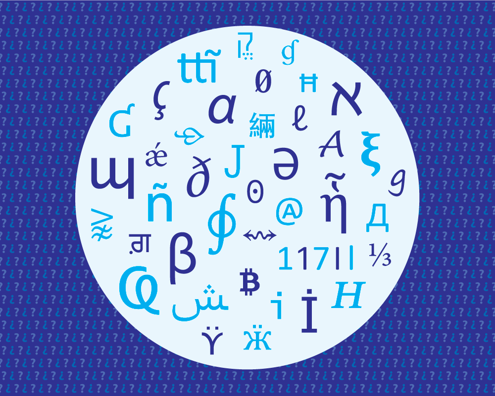
Updates to our Letter and Symbol Misrecognition [...] paper on the Typography.Guru website
Our paper Letter and Symbol Misrecognition in Highly Legible Typefaces for General, Children, Dyslexic, Visually Impaired and Ageing Readers [2019 4th Edition] has been updated with new information and editorially corrected. Thanks again to Ralf. May 2019.
Typographic Style Handbook book review
We have done an extensive book review of the Typographic Style Handbook by Michael Mitchell and Susan Wightman in the Information Design Journal, 24(2), 2018. April 2019.

No More New Similar Typefaces for Extended Reading, Please! paper
For a 2nd time we have partnered with Ralf Herrmann from the Typography.Guru website, to publish our paper No More New Similar Typefaces for Extended Reading, Please! This paper seeks to briefly explore the issues of typeface design similarity and usefulness, in contemporary typeface design and development. November 2018.
New chapter in Citizen Designer (2nd Edition) book
We have written a chapter titled Accessibility and Usability in Communication Design on pages 140–157 in a new book title Citizen Designer: Perspectives on Design Responsibility (2nd Edition) by Steven Heller and Veronique Vienne. The chapter involved quite a bit of work and includes 46 references. We read the book all the way through and what would we say about it?:
‘The most amazing book, the content is relevant, thought‑provoking and insightful. Almost every page raises many valid points. It is really a treasure trove of issues. This book is a great read for every graphic communication designer. Find out about your responsibilities as a graphic communication designer’.
Buy the book direct from Skyhorse Publishing/Allworth Press website. Many thanks to Steven. August 2018.

What Do Graphic Communication Designers Do? [...] paper
We have published a paper called What Do Graphic Communication Designers Do? Some Thoughts and a List of Disciplines and Specialisms on our Medium, to show what graphic designers do, the areas they have to know about, and also for people choosing a career in this field. February 2018.

Information on Different Categories of People […] paper and infographic
(Note: this paper was originally published on the Usability Geek website in February 2018. In May 2020, we moved it to our Medium so we can update it more easily.)
Our paper Information on Different Categories of People for Graphic Communication, Website and Information Designers Including Free Reusable Infographic has been published on the Usability Geek website. This is the 2nd time we have collaborated with Usability Geek. There is also a freely reusable and copyright free infographic at the end of the paper that accompanies the paper. You can download the infographic as a PDF (good for printing), PNG (good for email), or HTML (online webpage). Thanks again to Justin.
Susan Weinschenk (PhD in psychology) and CEO at The Team W showcased this paper in her April 2018 email newsletter. And in 2015 we reviewed her book 100 Things Every Designer Needs to Know About People in the Information Design Journal 21(1), 2014.
The A11Y Project that provide a great accessibility checklist for website designers, have linked to the paper and infographic on their Resources section.
The Public Library Accessibility Resource Centre (PLARC) and its website Accessible Libraries, is a collaborative project between the National Network for Equitable Library Service (NNELS) and the Centre for Equitable Library Access (CELA) in Canada, they have linked to our paper on their website. February 2018.

10 Tips For Better Book Designs paper republished on UXPlanet.org
Our paper 10 Tips For Better Book Designs has been republished on the UXPlanet.org website. (This is the 4th time this paper has been requested to be republished.) Thanks to Nick. October 2017.
Small Print In Graphic Communication and Information Design: A Discussion of Issues and Interactions paper
(Note: this paper was originally published on the Usability Geek website in January 2017. In April 2023, we moved it to our Medium so we can update it more easily.)
Our paper Small Print In Graphic Communication and Information Design: A Discussion of Issues and Interactions has been published on the Usability Geek website. Thanks to Justin. January 2017.

Letter and Symbol Misrecognition […] paper updated on the Typography.Guru website, and interview with Steven Heller
Our paper Letter and Symbol Misrecognition in Highly Legible Typefaces for General, Children, Dyslexic, Visually Impaired and Ageing Readers [2016 2nd Edition] has been updated and republished on the Typography.Guru website, as a 2016 2nd edition. (Updates and corrections were done to the text, figures and references.)
Thanks once again to Ralf from Typography.Guru, and also Steven Heller the renowned graphic design writer, who interviewed us about the paper in his Daily Heller: Type for Impaired Eyes, Print Magazine, 24th October 2016.
Snapshots III book
Our paper 10 Tips for Better Book Designs has been republished in a book called Snapshots III (ISBN: 978-1-909362-03-1) produced by Book Machine and Kingston University Press. It contains short papers from a range of people in the publishing industry. More information about the book can be found here. August 2016.

Letter and Symbol Misrecognition […] paper published on the Typography.Guru website
Our paper Letter and Symbol Misrecognition in Highly Legible Typefaces for General, Children, Dyslexic, Visually Impaired and Ageing Readers has been published on the Typography.Guru website. Thanks also to Design Week, ilovetypography.com, Smashing Magazine, The Association of Registered Graphic Designers (RGD) and Typostrate for taking an interest in the paper. December 2015.
Letter and Symbol Misrecognition […] paper and book review in the Information Design Journal
Our paper Letter and Symbol Misrecognition in Highly Legible Typefaces for General, Children, Dyslexic, Visually Impaired and Ageing Readers has been published in the Information Design Journal, 21(1), 2014. We also reviewed Susan Weinschenk’s great book 100 Things Every Designer Needs to Know About People at the end. June 2015.

10 Tips for Better Book Designs paper
Our paper has been republished for a 3rd time in a near original form, on the Book Machine website. March 2015.
When Information Design is a Matter of Life or Death paper
Our double peer-reviewed paper When Information Design is a Matter of Life or Death has been published on the Boxes and Arrows website. November 2014.
10 Tips for Better Book Designs paper
Our paper 10 Tips for Better Book Designs has been published on Creative Choices (website not online anymore), and in their email newsletter (issue 172, January 2014). January 2014.
10 Tips for Better Book Designs paper
Our paper 10 Tips for Better Book Designs has been published on the Creative Bloq website. (The paper was heavily edited by them and some content was not included.) October 2013.
Hiut typographic magazine
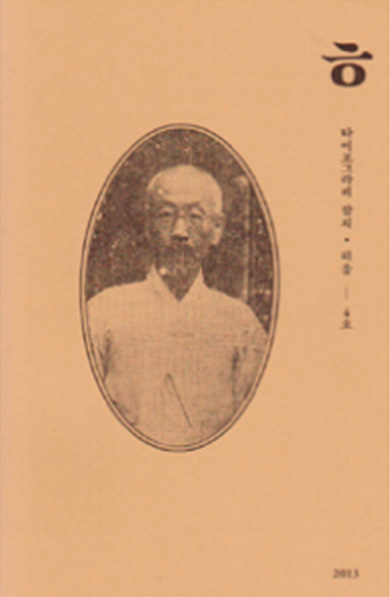
A short version of our paper Letter and Symbol Misrecognition in Highly Legible Typefaces for General, Children, Dyslexic, Visually Impaired and Ageing Readers has been publishing in Korean, in the typographic magazine Hiut, 4(2), 2013.
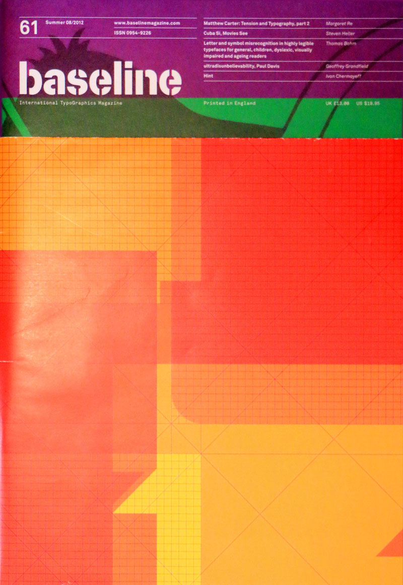
Letter and Symbol Misrecognition […] paper published in the international typographics magazines Baseline 61 and Slanted #18
Our paper Letter and Symbol Misrecognition in Highly Legible Typefaces for General, Children, Dyslexic, Visually Impaired and Ageing Readers has been published in Baseline 61 (2012), Kent, U.K. Launched in 1979, it is the authoritative magazine about type and typography.
The paper has also been published in the typographic magazine Slanted #18, Signage/Orientation from Karlsruhe, Germany.
The paper is essential reading for anyone interested in legibility, clear typographic design, typeface design and typographic accessibility. June 2012.

Paper published in the Information Design Journal
Our paper Getting Around the Reproduction Problems of Colored Graphs has been published in the international peer-reviewed Information Design Journal, 18(1), 2010. John Benjamins, Amsterdam. August 2010.

International collaborative project with the Communication Research Institute
We took part in an international collaborative communication research project called Credit Card Statements: Communication Benchmarks 2009, for the Communication Research Institute, Australia. View project report and findings (PDF). May 2009.
