We find out what you and your users want and need the publication to do, then analyse the content and figure-out how to design and communicate it, to make it work well. We analyse, structure, layout and design your information, making it highly appealing and easy‑to‑read so it gets used. Publications help to inform and impress, and are a valuable interface between your organisation and users. We are knowledgeable about page layout, grid systems, image structures, typography, stylesheets and material considerations like printing, paper and binding. Publications can be setup to the printer’s specification, or as PDFs, or in accessible formats such as large print, giant print, easy read or HTML.
Communicate better with more people
We design
- Annual reports and reviews.
- Booklets.
- Catalogues and brochures.
- Exam papers.
- Instruction manuals.
- Magazines.
- Newspapers.
- Publications and newsletters.
Below is a selection of projects to give you an idea of just some of the projects we have worked on.

Client
Resource for Urban Design Information.
Project title
Placemaking.
Services
Publication designTypographic designTypesettingPhoto editing.
About the client
A platform for knowledge sharing between built environment professionals to promote best practice, and to play a key role in creating better places to live.
Client’s needs
This urban design resource organisation produces regular publications, to inform members and users. We were asked to redesign their Placemaking publication, an editorially-led, analytical publication providing an overview and case studies of the key issues facing placemakers today.
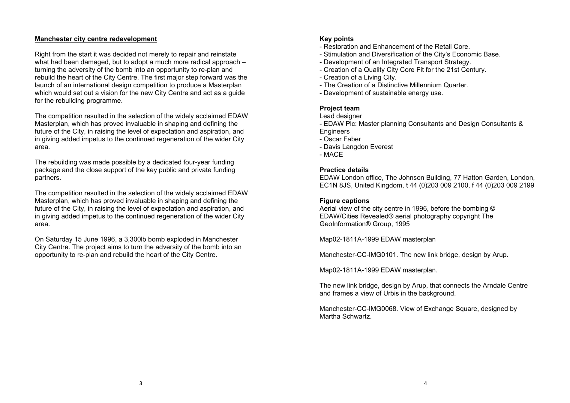
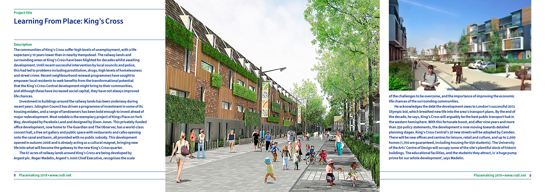
Before our redesign.
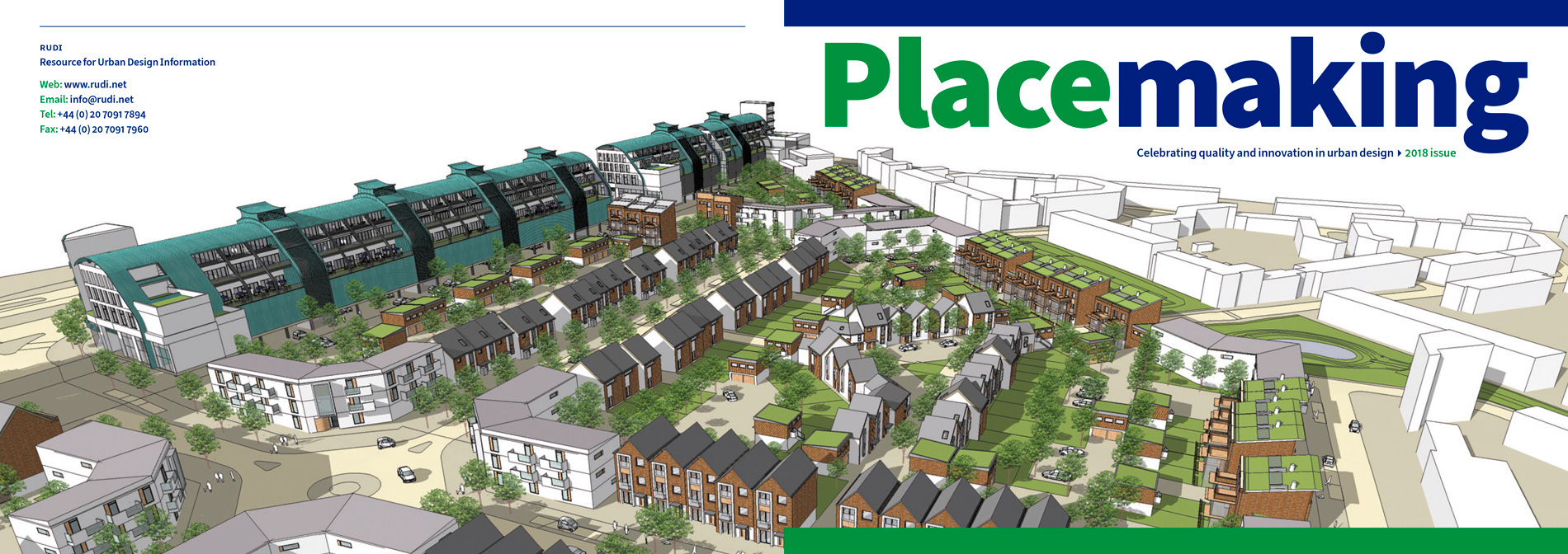
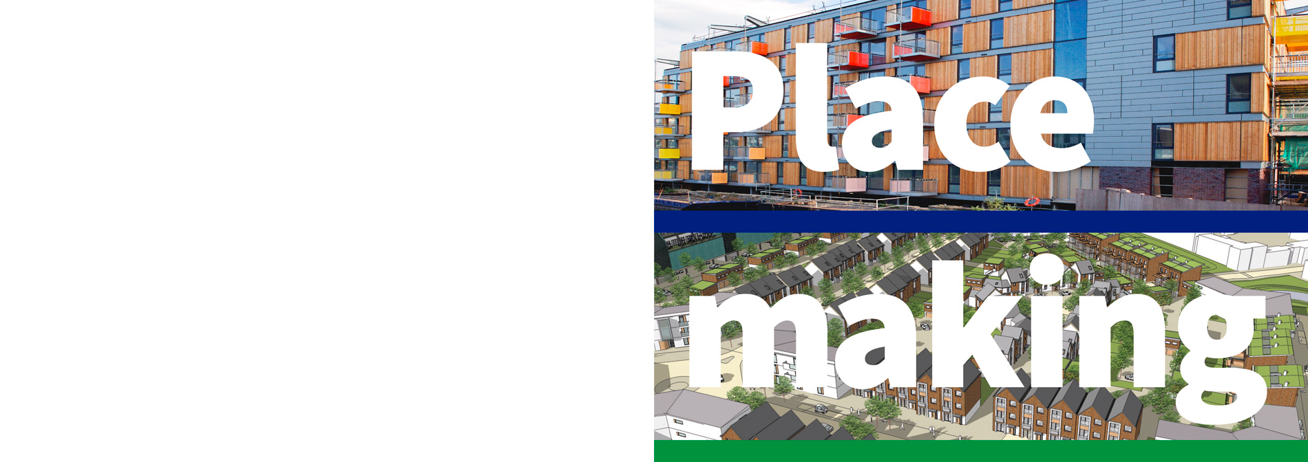
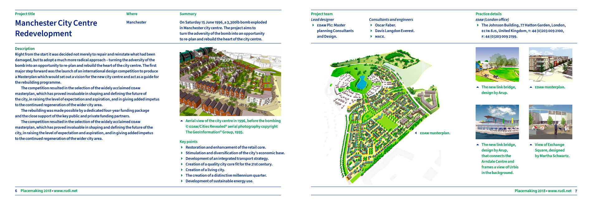
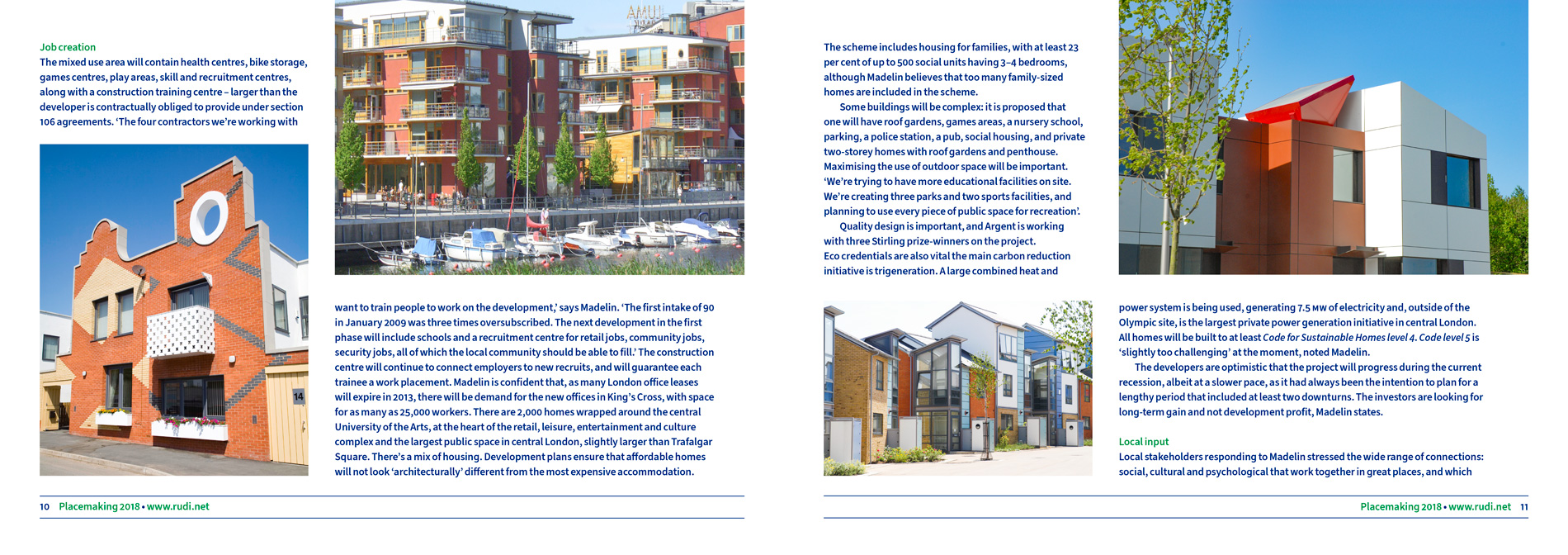
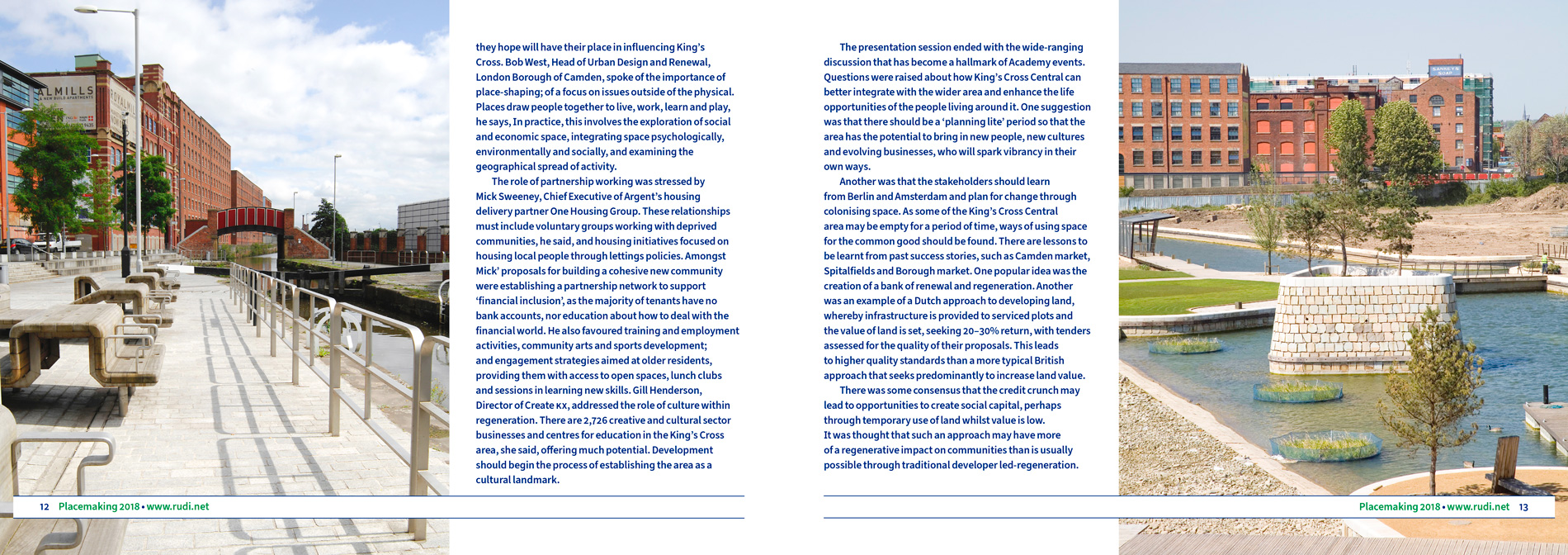
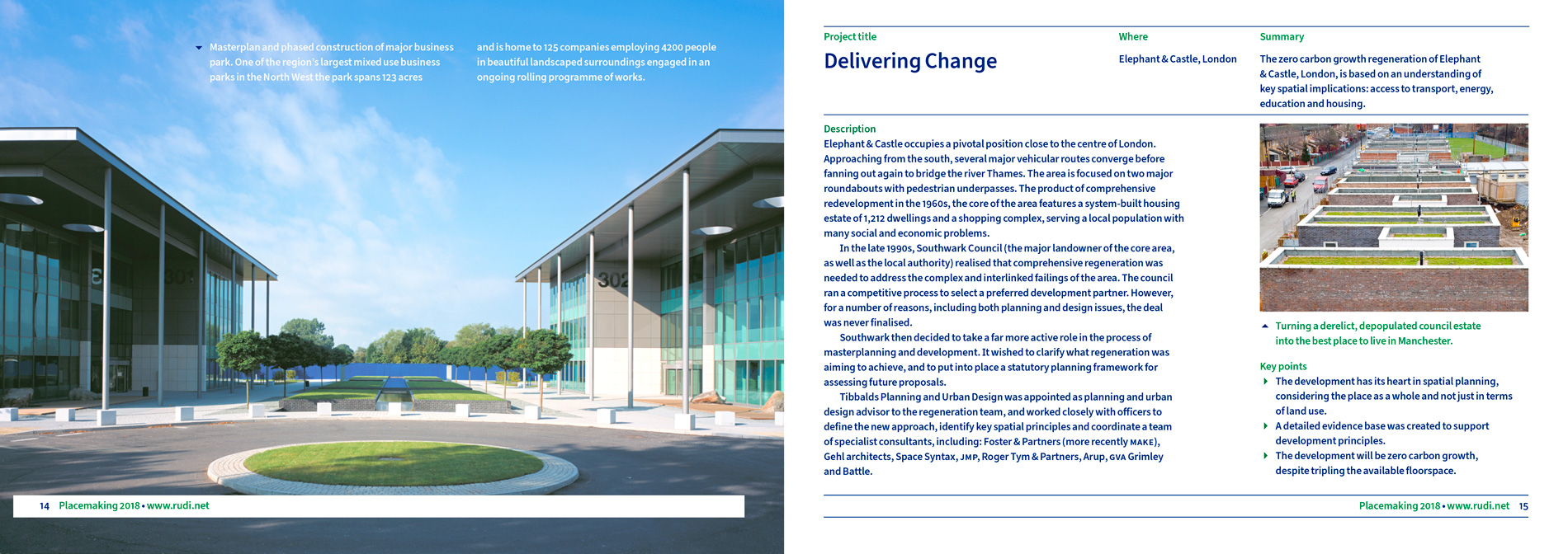
After our redesign.

Outline of what we did
We used an easily holdable and compact A4 landscape page size, that suited the different types and amounts of information, creating a less cluttered and less dense publication (compared to A4 portrait size). We split-up and emphasised the different parts of publication’s information, making it less boring and less like a straight-text publication, or typically default up and down black text Word document.
We developed and improved the branding, by using 2 main complimentary colours, a more modern typeface than used previously.
A well-designed grid system was setup, that allowed good layout of the content, effective sectioning and hierarchy of the information. The page layout is dynamic, engaging and compelling, utilising strong text and image structures. We also colour corrected the images and photography, that further enhanced the value and appeal of the publication.
These decisions lead to a much better publication design than previously, it was setup as a PDF, and displayed with pride on their website. The result is a very interesting, lively and stimulating showcase, that is distinctly branded and ready to be enjoyed by town planning, urban design and architectural professionals.
3 main improvements for them
- Better application of their corporate identity branding across their range of publications, reducing generic communication.
- Increased desirability and improved the effectiveness of the content, through laying-out and organising the information better.
- Analysed and then optimised their information and content, to make it work as well as possible for intended users, members, and their organisation’s objectives.
Details
Pages: 18Page size: A4: width 297mm × height 210mm.
Helped them sustain desire
Client
Dyslexia Institute.
Project title
Annual report and financial statements.
Services
Publication designTypesettingPaper selection supportInformation designTypographic design.
About the client
Provides teaching and support for people with dyslexia since 1972, with 12 centres throughout the U.K.
Client’s needs
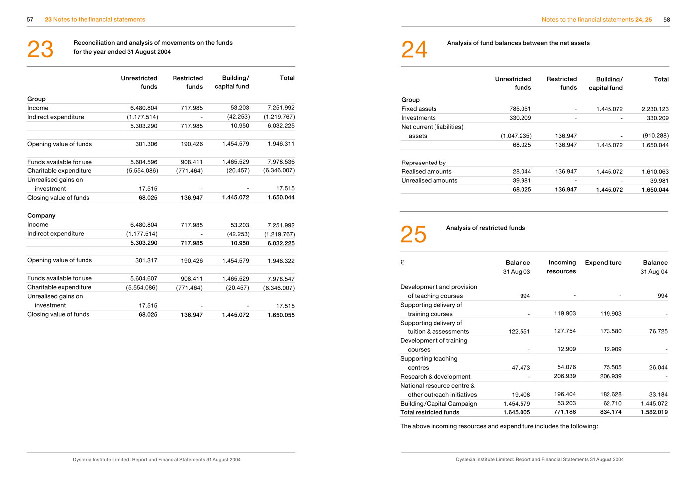
This dyslexia organisation needed help producing and designing a more professional annual report and financial statements than in previous years. Previously they had done the report in Word using amateur formatting, amateur text composition, not enough space between many table columns, and a highly debatable typeface choice Comic Sans.
Before our redesign.
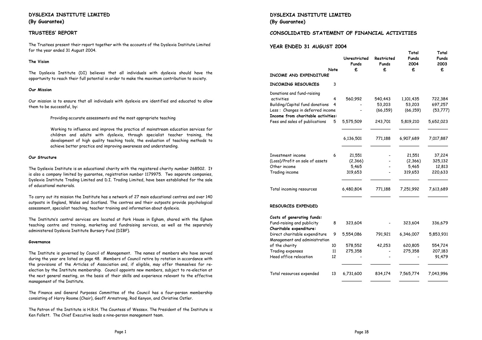
After our redesign.
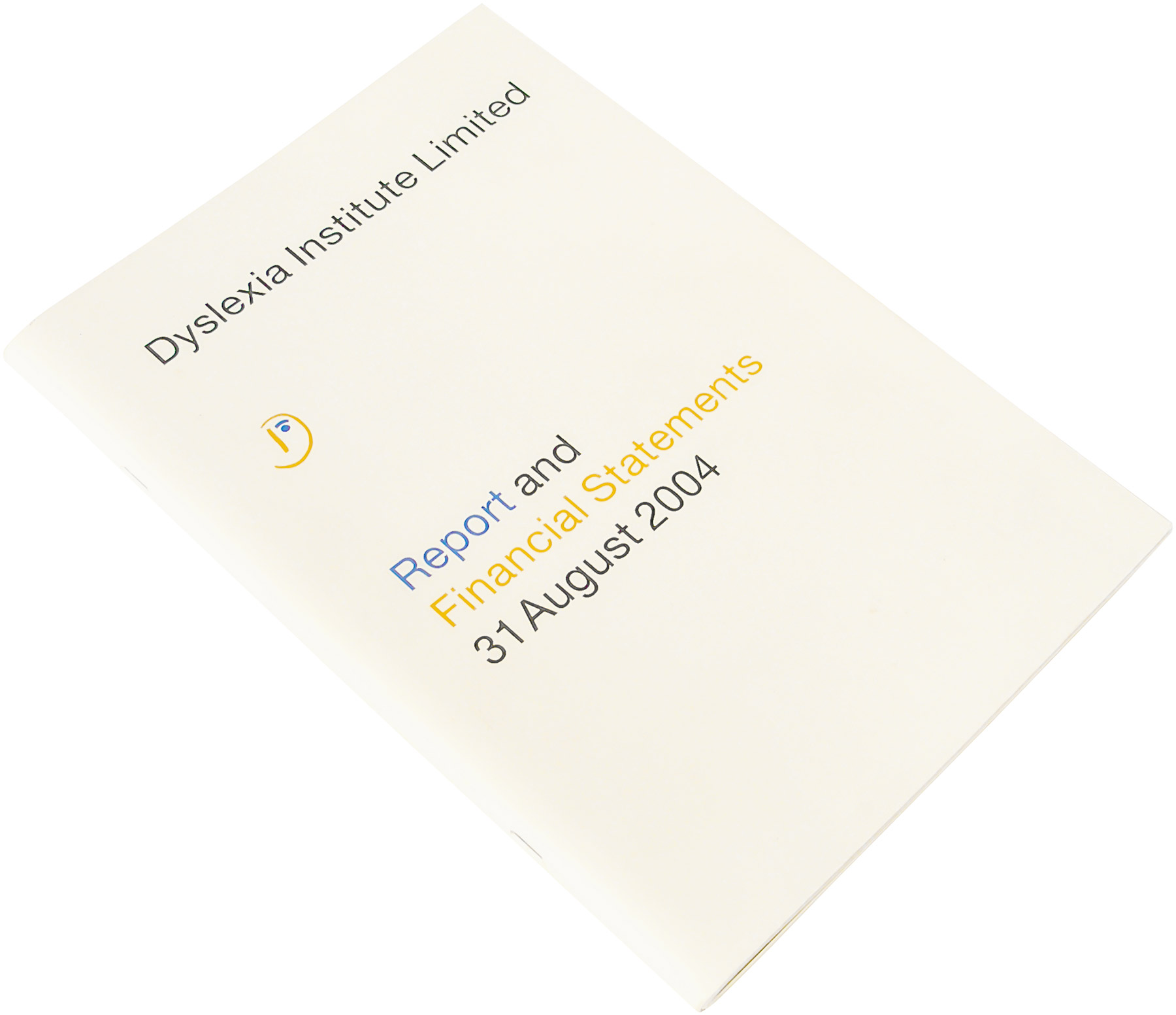
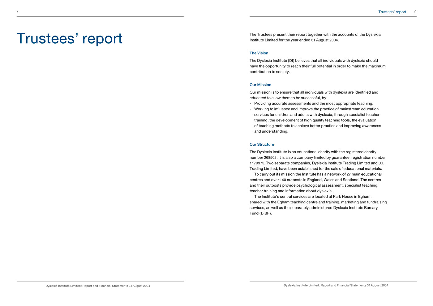
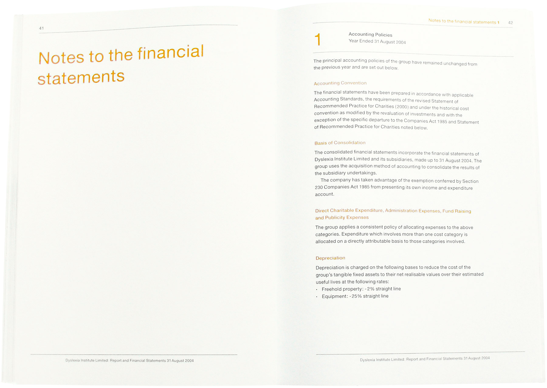
Outline of what we did
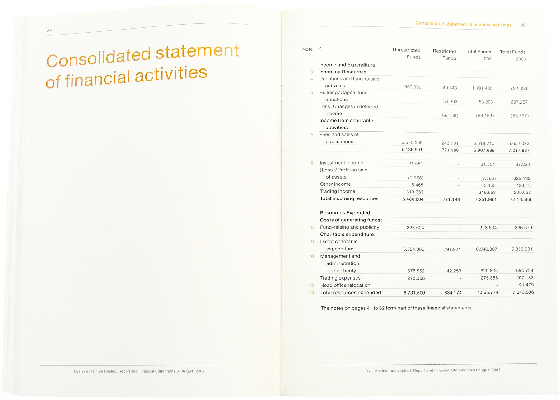
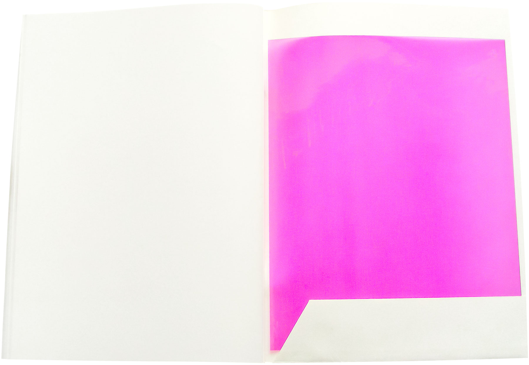
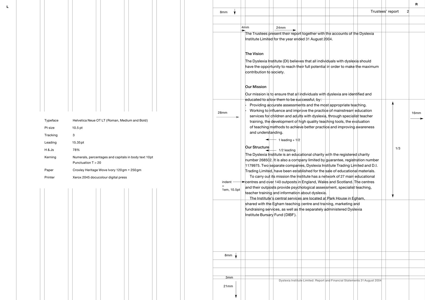
The client wanted a highly accessible graphic communication design, we did this through the overall design, layout and typography, and also included in the back of the publication, a purple acetate overlay to further make the publication even more accessible (some people with dyslexia prefer to read with a coloured acetate overlay). The publication contained a mass of complex financial information that needed to be designed and laid-out clearly. For numerical data we used tabular lining numbers that are easier‑to‑read and align better vertically. We put the report title at the bottom of all pages in the footer, and the section title in the top right running headers, so if people photocopy or save‑out individual PDF pages, they will always know what publication the page has come from. We researched, selected and sourced dyslexia-friendly off‑white/cream paper.
Note
When we did research in 2005 into the typographic requirements of people with dyslexia, there was conflicting advice ranging from handwritten typefaces, to serif, to sans-serif. Due to new research released in 2006, we would not use Helvetica again for people with dyslexia. Contact us for up‑to‑date in‑depth knowledge of designing for people with dyslexia.
User feedback
- Design manager: ‘They [the users] are not going to get lost’.
3 main improvements for them
- Built-in an acetate overlay feature on the last page of the annual report, that was a 1st in accessible dyslexia publication design.
- Decreased typographic layout usability errors and difficulties.
- Improved typographic clarity and communication for people with dyslexia and people in general, making the publication perform better than last year’s publication design.
Details
Pages: 70Page size: A4: width 210mm × height 297mmInside paper: Croxley Heritage Wove, ivory, 120g/m², 75% recycled.
They can read it better now
Client
ReDesign Youth.
Project title
Presentation.
Services
Publication designTypographic designFreehand illustrationTypesetting.
About the client
They work collaboratively with young people to consider design improvements to their environments.
Client’s needs
This youth organisation needed a quality electronic presentation to use at meetings in front of possible collaborating partners, businesses, funders, and when speaking at conferences to make a good impression.
Outline of what we did
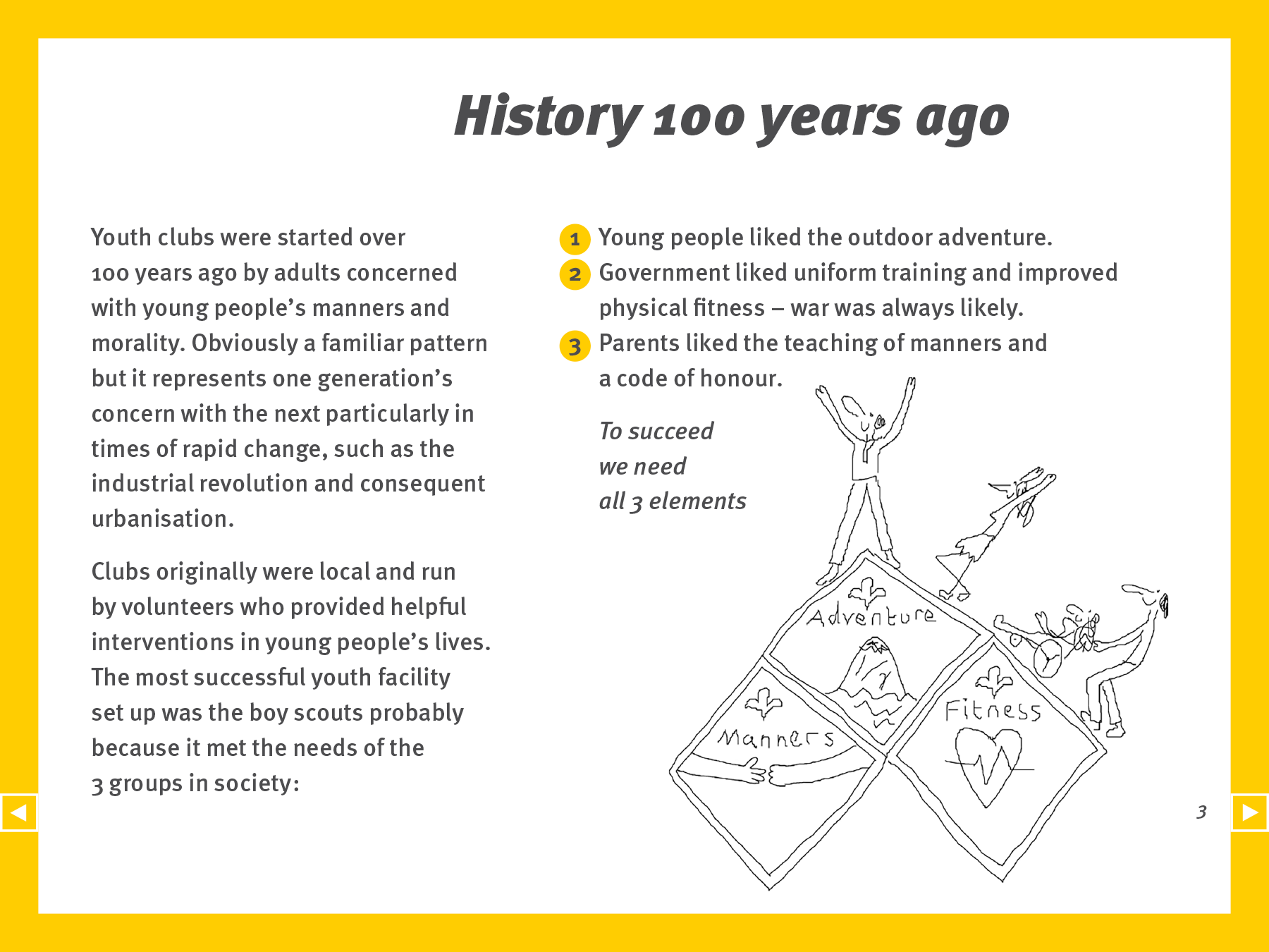
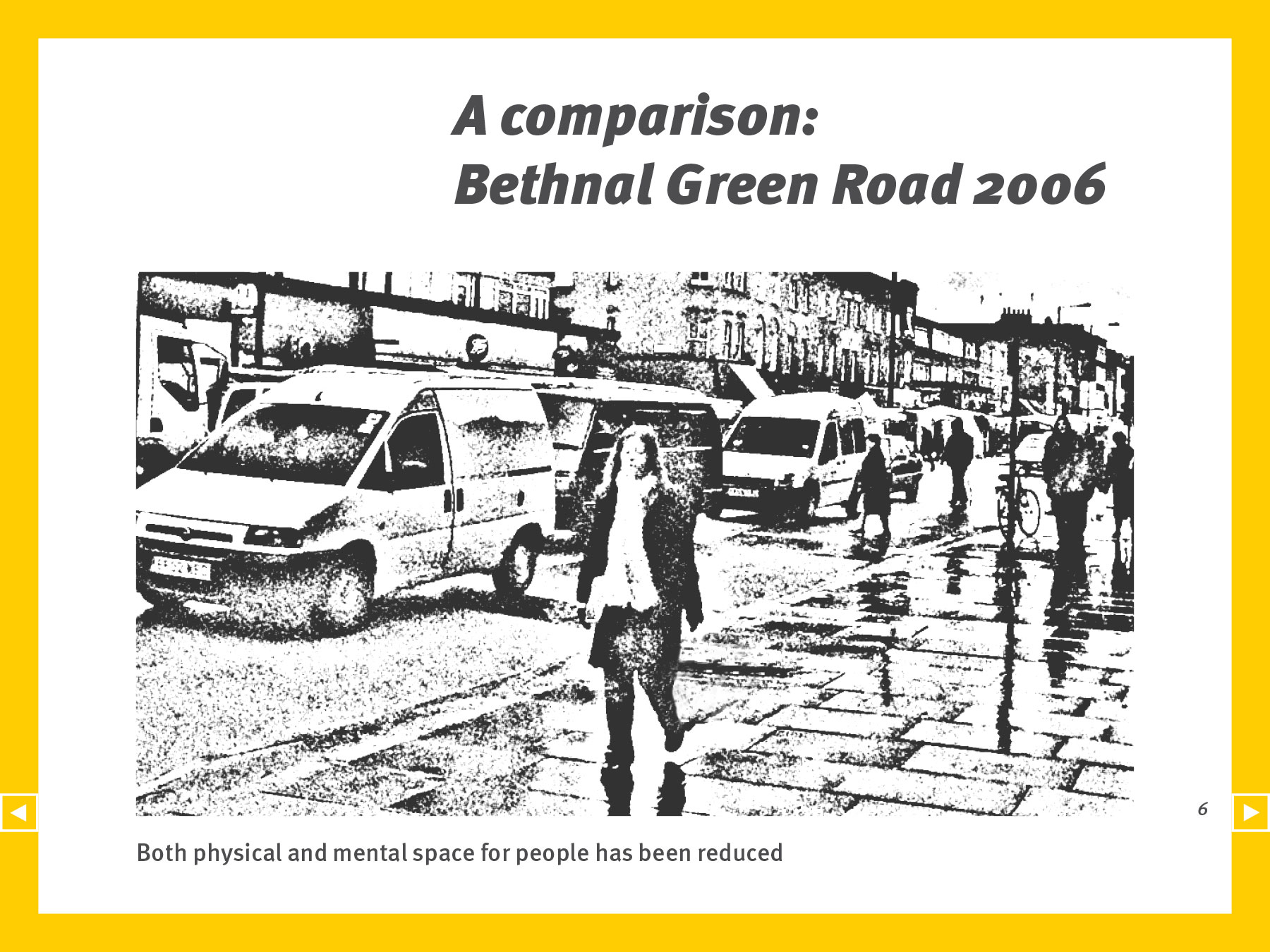
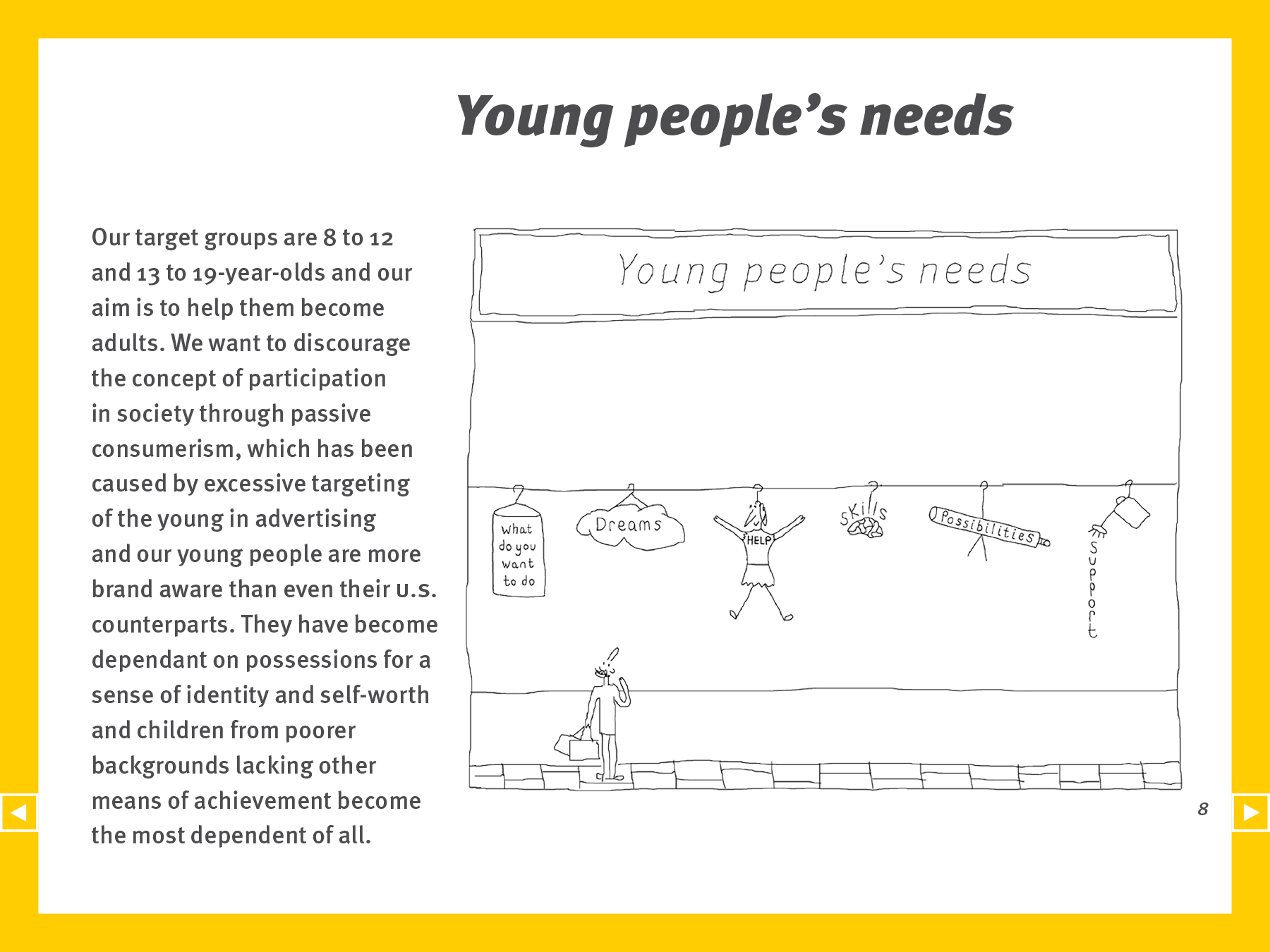
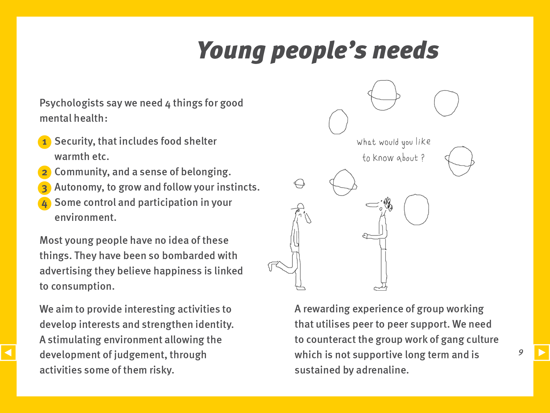
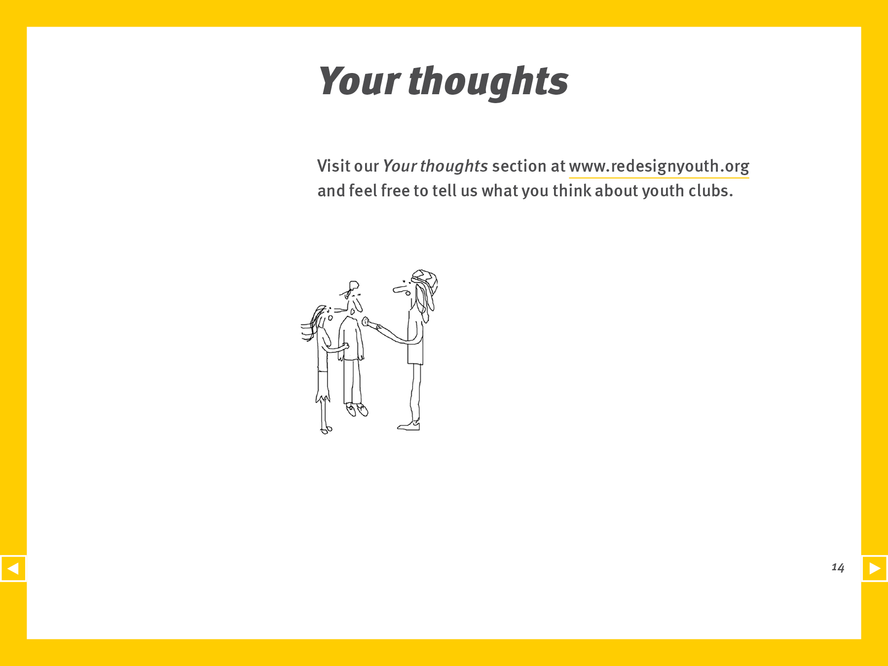
We designed this PDF presentation that fits their whole corporate identity and website, that we had designed previously. They utilised our freehand cartoon illustration that produces a presentation sure to engage and motivate young people. The cartoon illustrations were communicated and illustrated to be more than just something to look at (eye candy), and there is more to them than meets the eye… Bright and vibrant colours were used, along with active and bold typography, for a widely acceptable, modern and fun feel.
3 main improvements for them
- Increased the appeal of their business and helped them relate to their main user group, in a relevant and engaging way.
- Designed a high-resolution PDF presentation that can be opened on any computer with no software compatibility problems, and can be viewed at very large sizes and zoomed‑in if needed, with no loss of quality.
- Client support and customer service at every stage, in a quick and efficient manner.
Details
Pages: 14Page size: width 294mm × height 224mm.
Helped them to be valued and understood
3 results of a publication designed by us
1 Better organisation and design of your content, that serves your objectives, aspirations and users.
2 Better communication with your users about what you do and offer, in a credible and informative way.
3 Enhanced global presence of your service, organisation or company.
Create interest and get responses
We make more of a difference than you think! We would like to know more about your project
Contact us