The difference between accessibility and usability is easily confused, not obviously clear and seems to overlap. Get your tea or coffee ready because we are here to help!
What is accessibility?

Accessibility is mainly to do with what categories of people can or cannot access communication, products, services or buildings. And what devices, software or products they may use to help them. For example, people with vision impairments, or are ageing, or have dyslexia, have certain needs and specific requirements, to be able to access things as easily as everyone else. There are also things called access structures (Waller, 1979), that are not to do with different people’s needs, however, they allow better and more customisable access to graphic communication.
Examples of accessibility
An accessible website
Websites can have extra description, for example to describe the content of photographs, and extra tags put into the code of website to better describe the content, allowing screenreaders to better understand the webpage. If the person’s vision impairment is quite bad, they may not be able to depict and decipher the content and things inside the photograph, so how would they be able to read the photograph? Alt tags can be used to describe the image in a text form, that can then be read-out in audio form, using screenreader software.
alt="We can describe the content of an image in text form within this website coding tag, so it can be read-out in audio. Do you hear me?"
Access structures
In the area of graphic communication design, things like a search option on a website, an index in the back of a book, or a contents page at the front of a publication, allow better access to the information. Even simple heading levels like heading 1, heading 2 and heading 3, allow much better access into information. Imagine if the information was 1 large block of text with no indents, headings, punctuation, formatting or paragraph spaces, how easy then would it be to use..?
Yes access structures increase and improve usability, however, they are more directed at allowing better access to information.
Accessibility and laws
Since 2010, there has been great improvements, interest and new laws introduced around accessibility issues:

- The Law and Requirements webpage by The Plain Language Action and Information Network. Also the Plain Writing Act of 2010 in America signed on the 13th October 2010, requiring federal agencies (the American government) to use clear communication, that the public will understand and be able to use.

- The Web Accessibility Initiative (WAI) Web Accessibility Laws and Policies webpage by the W3C (World Wide Web Consortium), lists accessibility laws throughout the world.
Examples of accessibility that you may have experienced
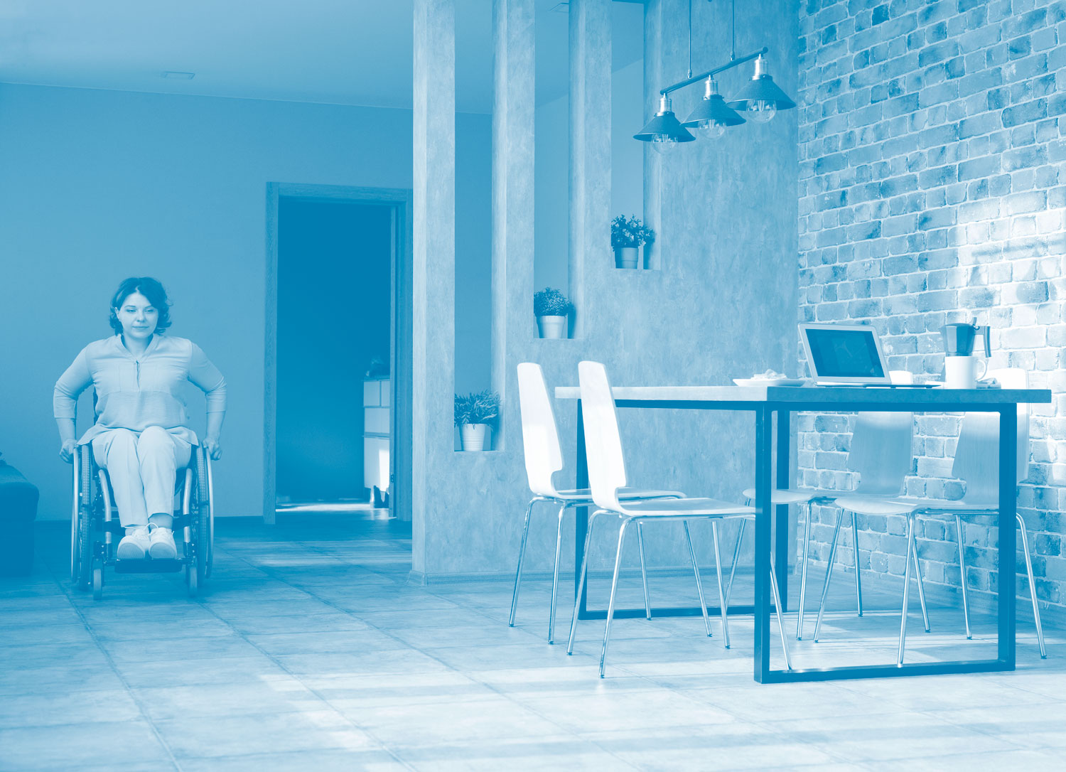
An obvious example is better access to public buildings through wider entrances, lifts and larger open-door buttons at waist height, so if someone is using a wheelchair, or has a physical disability, or are using a vision impairment stick, they can do what they need to, just like anyone else. Just because some people might be less able than what is typical, does not mean they have to suffer…
In recent years, art galleries, museums and theatres have increasingly been making available portable audio descriptions (like on MP3 players), that bring alive what is on display, describing what is happening, and can even navigate users around the building (how amazing is that?). It is these sorts of ideas and devices, that highlight how transformational communication can be.
What is usability?
Usability is the actual using and interaction with the communication, product, service, or building. It is more to do with if people can or cannot do what they need to, or accomplish tasks. More specifically, usability experts and usability testers make a note of and analyse usability errors, and then fix them, to remove barriers and difficulties, to improve usability, ease-of-use and productivity.
Examples of usability
The graphic communication design of a webpage
A typical example is that you could be presented with a webpage that has loads of text information, with very little leading (space between the lines of text), that also uses a very small sized typeface, and with advertisements that you do not care for. Can things get any more difficult to use? yes! An issue that is increasingly being encountered, is cookie policy accept/deny warning boxes popping-up when you 1st visit a webpage, that completely distracts and blocks your natural use of the webpage. But then you dismiss the cookie policy settings box, and then another email newsletter box pops-up asking if you want to subscribe, that is another thing you have to do, even before you have started to use and read the webpage! Can things get anymore difficult? yes. Another pop-up box appears asking if you want to receive update/news notifications from the website, and then another 1 that asks if you want the website to allow or block access to your physical location. All of this creates a hard to use and over‑demanding graphic communication… that distracts, over‑complicates and creates extra barriers to your information, that can be very costly for your business or organisation, because it increases the chance of your users leaving and rejecting your item. Say goodbye to your users and customers in less than 3 seconds, these are the everyday realities of bad usability because of over-difficult design, information and communication.
I cannot read this text, what does it say? Arghhh why is it so hard and demanding, but why? My day has already been so demanding and I do not have the time or effort!!! Come on, things should be easier than this…
Not being able to find easy and basic information
Maybe you were using a webpage or reading a monthly utility bill, and you could not find a telephone number or email address that you needed to clear-up a question you had? Sound familiar? yes we know… Or it could be that you cannot find an option to change a setting on your smartphone, because you are lost in submenus, and subsequently cannot do what you intended to do.

Plain English assumptions and guarantees… A plain English description of plain English is hard to write…
As an example, if I said to you ‘what is the size of the image you need for the website’, and then you replied ‘190 × 260’. This may sound fine, however, there are a few usability issues with this. 1st which of the 2 measurements is the width and which is the height? It is more standard practice to say the width measurement value 1st, then the height measurements value 2nd, however this is certainly not a precise assumption, and it could easily be the height 1st, then the width 2nd. Different countries also have different ways of commonly formatting information. Then, what is the measurement value of the 2 numbers? Is it centimetres (cm), millimetres (mm), metres (m), inches (in), picas (p), points (pt), pixels (px), ems or maybe rems? If you were a supplier of DIY (do it yourself) materials, what would happen if you supplied measurement information this way in your catalogue or on your website… Well there are consequences for all involved, that spreads all the way through the system. For people and customers, they may not be 100% sure what the size of the thing is they are ordering, and may order it, go all the way to pick-it-up, then get back, to find out that it is not the right size. Then they have to contact you, return it, and start it all over again. The seller has to deal with returns, an increase in the amount of customer communications, and additionally potential damage to your brand, because of your users’ bad user experience. Issues like this are surprisingly common, and are encountered on a daily basis by millions of people.
Are you a lefty or a righty?
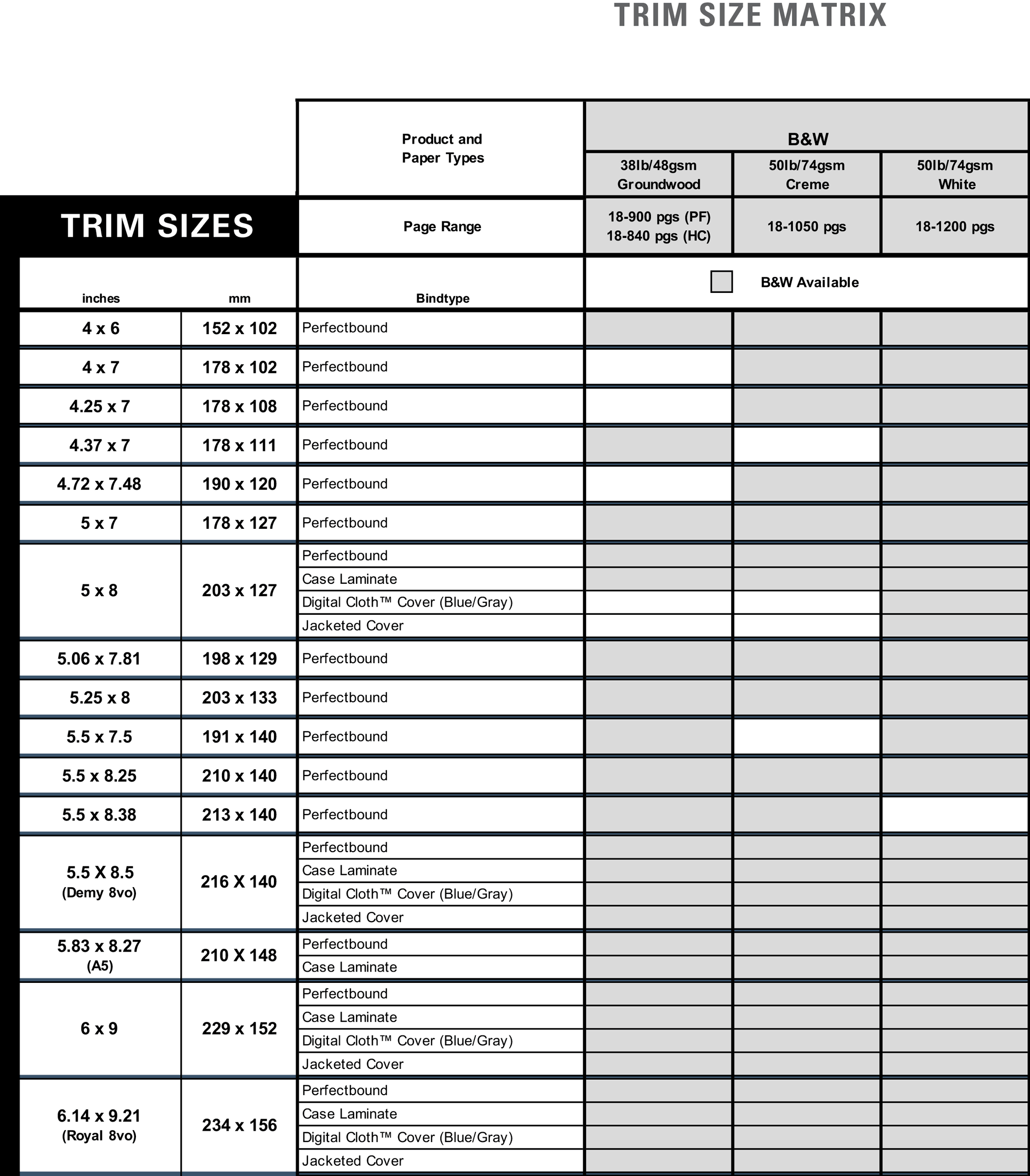
And to illustrate this point, in July 2022 we looked through the Lightning Source, File Creation Guide (Version 6.1.22) PDF from the U.K.’s largest print-on-demand book printer, to clarify a book page size we had been given of 229 × 152. The client was out of the office and we were not sure what measurement was the width, and what was the height, was it in mm or inches, or something else? We then went to look at the allowed book page sizes on page 40, we could not believe what we saw. So in the Trim Sizes columns (in the table above), there is 1 for the page size in inches and 1 for mm. Can you see what the problem is, and there is a big 1? It might not be immediately obvious… The page sizes in the inches column are in the format of width × height, the page sizes in the mm column are in the format of height × width… Nowhere is this stated and if you have no experience of dealing with book page sizes, you may not even know which is the height or which is the width for either columns, let alone which order it is… If you have designed and formatted a 300-page book, then get told by Lightning Source that your book is not an allowed page size, or that you have misread the measurement format (for example, width × height, or height × width) you have quite a problem and many more hours work to do… We would advise Lightning Source to redesign and use designers with knowledge of accessibility and usability. We suspect (although do not know exactly), that this bad design creates a lot of problems for everyone involved, and unnecessarily.
Another example is the following 190–260 units. So editors, graphic communications designers or people who work with information on a daily basis would know that the en dash (the long minus-like sign inbetween the 2 number values) stands for the word to, however using this formatting for people who do not work with text or graphic communication, or who have a low level of literacy, will have no idea about how to interpret this sign and value (GOV UK, 2016). It could even communicate to some people, the mathematical minus sign 190 - 260 (190 minus 260)… It is part usability to find out and foresee issues like this, as they can do a lot of damage to communication and take-up more time and effort than is usual for people.
Wat u mean mate..?
How important are accessibility and usability, and what are their effects?
Accessibility and usability are as important as every other aspect of your communications, products, services, or buildings. Even equally as important as how beautiful the design is (aesthetics), that gets the most time and attention in design projects. If different categories of people cannot access your communication, products, services, or buildings, they will probably reject it and turn away, and then your communication has excluded them. Those people may even be potential customers or services users… that makes customers who are not using you, and creates lost sales.

It makes your business more successful
Usability is the whole bowls of design and communication, if something looks good, but you cannot read it or understand it, then what? Small subtle not obvious changes in layout, colours, text, wording and technical aspects, have a huge impact on accessibility and usability.
Then there is the issue of the increased time and stress for people, if things are not accessible and usable, it wastes people’s time and increases stress, and damages the user’s experience of your service, harming your brand and reputation. This is not made-up, or some salesperson’s strategy, this is reality!
Accessibility has received great interest in general since 2010, especially by website designers, and for buildings being used regularly by members of the public. The web is a very open medium and everyone should be able to enjoy it, it is what the internet is all about, and to exclude and create barriers to web content, goes against what it is for and about, at its core. Accessibility and usability are critical factors that make-up what good design is.
Would you like to know more about accessibility and usability?

In almost all of the projects on this website, we have improved accessibility and usability issues and problems for the client’s communication, massively. If you have a browse around this website, in the yellow navigation menu at the top of webpages, see the Book Design, Journal Design, Information Design, Publication Design, Redrawing and Website Design sections, and some of the projects have a before our redesign image, and after our redesign image.
Advancing experiences
Find out more about accessibility

- Web Accessibility Initiative (WAI) Accessibility Principles by the W3C (World Wide Web Consortium), who produce guidelines, advice and set standards for the best practice of designing accessible websites. The webpage has good examples of website design accessibility problems and issues, outlines why the issue needs to be addressed, and then tells you how to fix it.
- Information on Different Categories of People for Graphic Communication, Website and Information Designers that includes a freely reusable infographic, ideal for using on website accessibility statements. This is a research and statistical research paper written by us.

- Inclusive Design Toolkit by the University of Cambridge, U.K. A great outline and introduction into inclusive design, with many interesting features and insights. For more inclusive design resources, see also the University of Cambridge Engineering Design Centre website.
Find out more about usability

- Usability.gov is a leading resource for user experience (UX), containing best practice information and guidelines, serving practitioners and students in the government and private sectors.
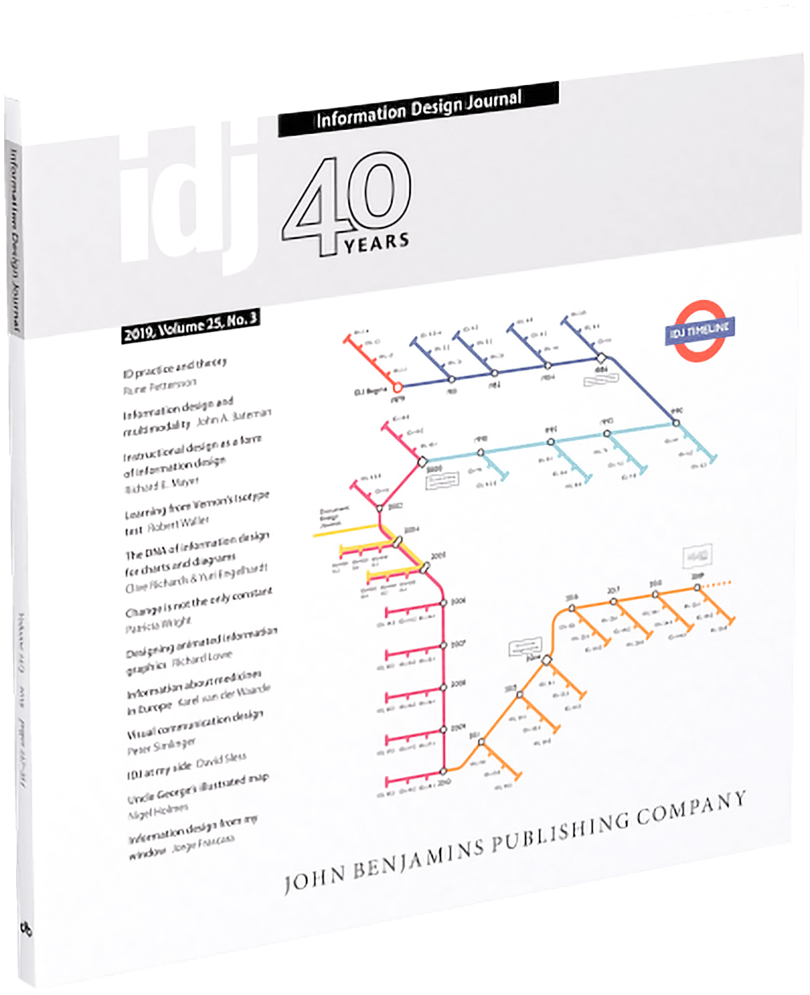
- Information Design Journal is a peer-reviewed international journal that bridges the gap between research and practice in information design. Started in 1979 it publishes world-class academic papers, interviews and other pieces on information design issues.

- Nielsen Norman Group research-based user experience organisation, they write articles, conduct studies, present before and after case studies, and arrange worldwide conferences, that gives you a starter into usability problems and improvements.
Connected terminologies and areas around accessibility and usability
Design for all
The design of products, services, systems and communications for as many people as possible, without the need for extra aids.
Ergonomics
Reduces human error, increases productivity, and enhances safety and comfort with a specific focus on the interaction, between the human and the thing of interest.
Inclusive design
Aims to remove the barriers that exclude people. Design is used to enable everyone to participate equally, confidently and independently in everyday activities.
Plain English and clear language
Clear and easy-to-understand writing and information.
Universal design
The design of buildings, products or environments to make them accessible to all people, regardless of age, disability or other factors.
User-centred design
An iterative design process where designers focus on the users and their needs, in each phase of the design process.
User experience
How a user interacts with and experiences a product, system or service.
Concluding observations
It does not matter too much about being absolutely precise about accessibility and usability terminology, what matters is that they are both addressed, and we do hope you found it insightful. Accessibility and usability issues are critical to your communications, especially since 2010, their importance has been gaining massive wide-spread value and momentum. You can only go so far using your own understanding, you need access to experts like us, and to test with users (the people you are actually designing for). You are not the only one using the communication, product, service or building. It is unlikely that good and effective design will come from chance or expression…
Any tea or coffee left? You have done well, thanks for reading. We can help you substantially decrease the complexity, time and difficulty of designing information that works well for a wide-range of people. There is no need to be afraid… contact us.
It is what we do!