Information design is specifically about content, complexity, usability and optimisation, and differs from just graphic design, or just plain English, because it is about all the elements needing to work together, to enable successful communication with people (longer description near the end of this webpage). We analyse your content and users, then figure-out what needs to be done to make it work well. Information design leads to more successful numerically measured communication, because we can test it with people and then fix the errors. User testing moves your design and communication from a linear output to circular. If you need your information and communication to work well, information design is for you. We live in challenging information-rich times and we always try to use an information design approach.
Make it work really well, and know it works really well
We do
- Intermediate plain English writing and editing.
- Complex document design and API (application programming interface) documentation design.
- Form and questionnaire design.
- Letter, bill and statement design.
- Medicine/patient information leaflet (PIL) design.
- Pictogram design and illustration.
- Wayfinding and signage.
- Usability testing with people and getting user feedback (we can get data on how well or how not well, your communication is actually working with people, often using diagnostic testing).
- Monitoring design, information and communication over a period of time, to make sure it keeps working.
- User experience (UX) design and user research.
Below is a selection of projects to give you an idea of just some of the projects we have worked on.
Client
International Union of Architects (UIA) and Rehabilitation International (RI).
Project title
New international disability and accessibility pictogram redesign.
Services
Technical illustrationUser testingInformation design.
About the clients
International Union of Architects (UIA) is a professional organisation working to unify architects, and the Rehabilitation International’s (RI) mission is to advance the rights and inclusion of people with disabilities worldwide.
Clients’ needs
They invited submissions for a 21st century symbol of accessibility to represent their core values of rights and inclusion, equity and independence, diversity, physical and virtual accessibility for all, including people with disabilities.

Outline of what we did
The person in a wheelchair is an aged and old-fashioned view of people with disabilities, not great hey? We started by thinking and sketching ideas for what a new pictogram could look like, and what aspects it would need to include and communicate. From here, we transferred ideas into software, then settled on 6 different pictogram designs to reconsider and test with people. For user testing, we tested with 5 people, 2 had multiple sclerosis, another person was a director of a company who helps people with disabilities, and then 2 general people. We used diagnostic testing and question testing, diagnostic testing of such a simple device produces quite limited responses, so we asked users questions to find out what aspects worked better than others. The user testing data shows mixed results, some good responses and some bad. It became clear that even if a pictogram is not understood, it could become more understood if used repeatedly over a long time… Another interesting aspect of user testing is the directness of users responses, they did not hold back on what they thought and also their often hilarious responses. We also considered international and cross-cultural issues to make the pictogram truly international, but concluded that representation of all cultures is a difficult task within such a small graphic device.
We have 6 different pictogram designs and feel the 1 submitted to competition works the best. We have it in black and white and using colour in CMYK, and also have user testing results with 5 people. Our pictogram design adheres to other woman and men signs in the International Organisation for Standardisation (ISO) symbol range, so it is not overly hard or abstract to understand.
We see the pictogram design as near final, with some possible last edits that could be made. It is surprising how much work, effort and editing was needed for such a simple pictogram. There was a financial prize, but also if successful, the design would be adopted by the International Organisation for Standardisation (ISO) and used internationally, in airports and on official warning signs. Our submission did not get an award but what would we say about the top-3 pictogram designs awarded? ‘not good’. Here are the winning entries.
Results
We have decided not to release the pictogram and project into the public for free, contact us for more information.
3 main improvements for them
- An up-to-date 21st century pictogram design, representing inclusion, equity, independence, diversity, gender, disability and accessibility.
- A new pictogram design not too distant from commonly understood pictograms, giving it more chance of being understood.
- Evidence and user testing data about how the design and communication is actually working with people.
Up-to-date inclusive communication and representation?
Client
Communication Research Institute (international collaborative project).
Project title
Credit card statements: communication benchmarks 2009.
Services
BenchmarkingUser testingInformation design.
About the client
Leading worldwide not-for-profit communication research organisation based on research results over 35 years, with 200+ leading organisations.
Client’s needs
They wanted to investigate and measure how well ordinary monthly bank statements work, like the bills that come through your postal letterbox on a monthly basis.
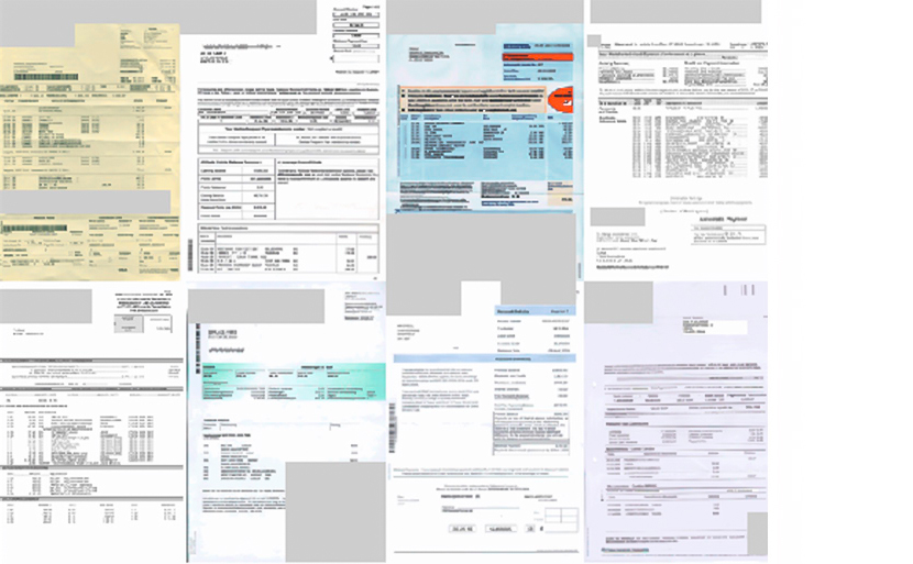
Reduced size showcase of the credit card statements from different countries.
Summary of the overall performance across all credit card statements.
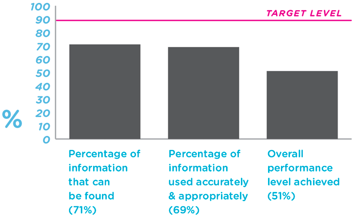
Performance level of tested tasks across all credit card statements.

Outline of what we did
11 fellows of the Communication Research Institute were contacted, with the task of finding out how well these financial statements work. Some of the diagnostic testing questions were:
- Can people find and explain the opening and closing balances.
- Can people find and explain how to avoid being charged interest.
- Can people find and explain how to find more information, or even contact the bank (how hard can this be? what could possibly go wrong?).
- Can people find and explain the available and overall credit limit.
We sourced a wide-range of people to use as testing participants, and of different age-ranges and abilities, then set them tasks to do, analysing what they could or could not do. We collected graphic communication performance evidence and data on the usability of the credit card statements. It is very valuable and gives the international banks concrete objective evidence about the health of their communications with customers, and highlights what is working well, and what is not working.
Results
View project report and findings (PDF). If you would like access to the full data, contact the Communication Research Institute.
3 main improvements for them
- Gave international banks concrete objective usability data, on tasks successfully or not successfully completed (we avoided opinion, preference or content quality testing).
- Sourced and recruited a wide-range of people, abilities, ages and educational levels for usability testing, to get data from a typical range of people and users.
- Defined a range of common and more challenging tasks (the scoping requirements) everyday people should be able to do and perform, with ease and confidence.
Gave them a measured evidence-based bonus
Client
Leicester BID (Business Improvement District).
Project title
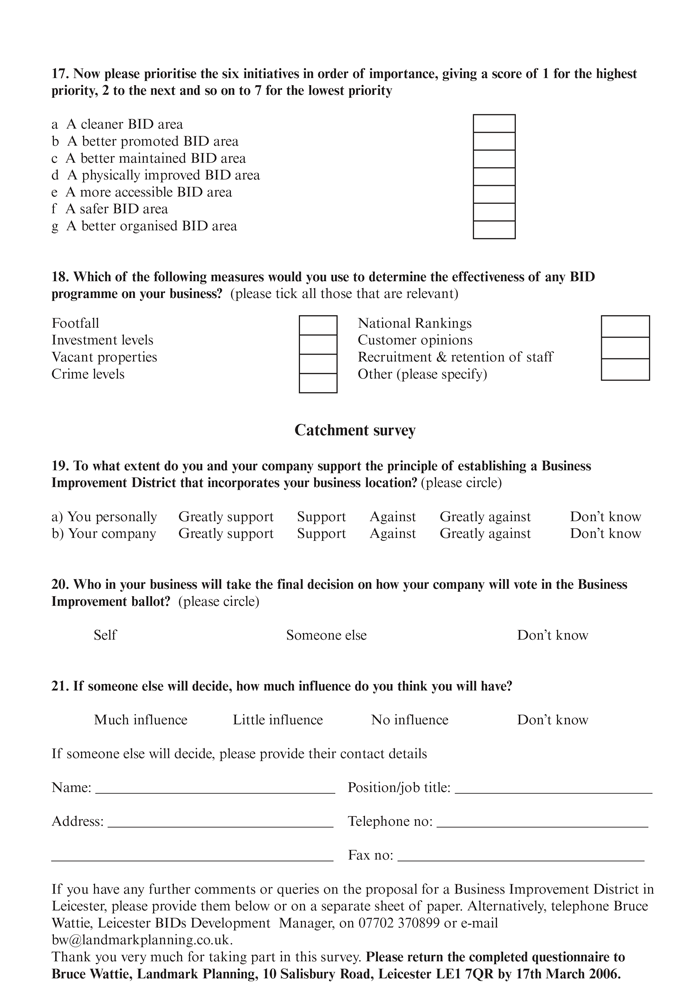
BID area questionnaire form.
Services
Information designPlain EnglishTypographic design.
About the client
A business-led not-for-profit organisation working to transform Leicester city centre in the United Kingdom, making it a better place to live, work, visit, study and do business.
Client’s needs
The organisation wanted to use design, to give their questionnaire form the best chance of collecting quality information, and collecting as much data as possible. They knew they needed design input with this type of typically boring and inconvenient document, as people often reject forms and hate filling them out.
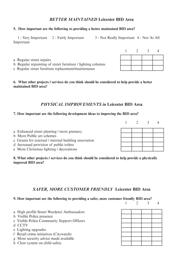
Before our redesign.
After our redesign.
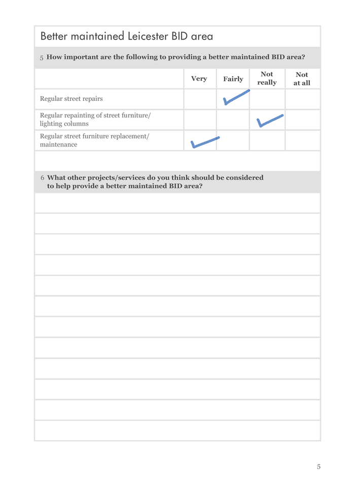
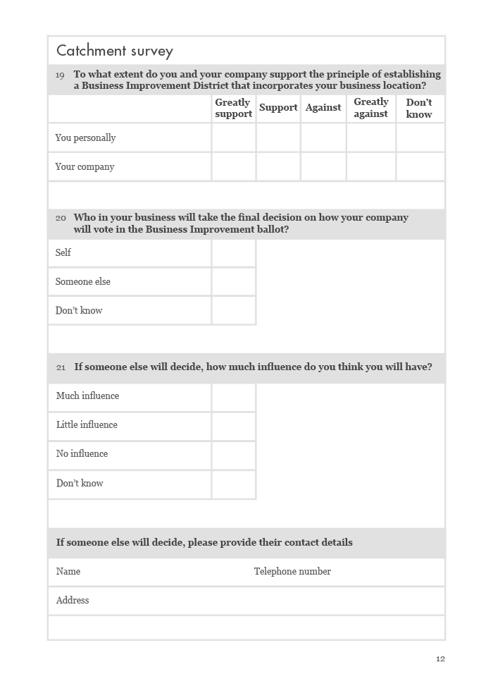
Outline of what we did
Their original form was not particularly clear, it was boring, highly generic and not engaging to read or use. We worked on the clarity and appeal of this inconvenient type of document, giving it much more chance of getting used, filled‑in and returned back to the client with useful data. The original form had not large enough spaces to write responses in by hand, making it hard for people to interact with, so we increased the space available to write in the form fields. We used clear language, editing, rewording and graphic communication design, to maximise wide-spread understanding. Another unusual aspect was that we avoided large full‑bleed areas of block colour and large background images, as many people would use an inkjet printer at home or work, that would cause people’s printer cartridges to drain unnecessarily.
3 main improvements for them
- Decreased staff hours needed to sort and go through returned forms and data from users.
- Increased the chance of getting a larger quantity of filled-in forms returned back, with increased data accuracy.
- Improved the form’s written tone of voice, reworded questions to reduce confusion, subsequently decreasing questions wrongly answered.
Helped their users form an opinion
Client
Dyslexia Institute.
Project title
Annual report and financial statements.
Services
Publication designTypographic designTypesettingInformation designPaper selection support.
About the client
Provides teaching and support for people with dyslexia since 1972, with 12 centres throughout the U.K.
Client’s needs
This dyslexia organisation needed help producing and designing a more professional annual report and financial statements than in previous years. Previously they had done the report in Word using amateur formatting, amateur text composition, not enough space between many table columns, and a highly debatable typeface choice Comic Sans.
Before our redesign.

After our redesign.


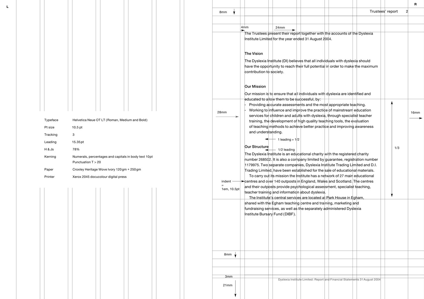
Outline of what we did
The client wanted a highly accessible graphic communication design, we did this through the overall design, layout and typography, and also included in the back of the publication, a purple acetate overlay to further make the publication even more accessible (some people with dyslexia prefer to read with a coloured acetate overlay). The publication contained a mass of complex financial information that needed to be designed and laid-out clearly. For numerical data we used tabular lining numbers that are easier‑to‑read and align better vertically. We put the report title at the bottom of all pages in the footer, and the section title in the top right running headers, so if people photocopy or save‑out individual PDF pages, they will always know what publication the page has come from. We researched, selected and sourced dyslexia-friendly off‑white/cream paper.
Note
When we did research in 2005 into the typographic requirements of people with dyslexia, there was conflicting advice ranging from handwritten typefaces, to serif, to sans-serif. Due to new research released in 2006, we would not use Helvetica again for people with dyslexia. Contact us for up‑to‑date in‑depth knowledge of designing for people with dyslexia.
User feedback
- Design manager: ‘They [the users] are not going to get lost’.
3 main improvements for them
- Built-in an acetate overlay feature on the last page of the annual report, that was a 1st in accessible dyslexia publication design.
- Decreased typographic layout usability errors and difficulties.
- Improved typographic clarity and communication for people with dyslexia and people in general, making the publication perform better than last year’s publication design.
Details
Pages: 70Page size: A4: width 210mm × height 297mmInside paper: Croxley Heritage Wove, ivory, 120g/m², 75% recycled.
They can read it better now
Client
Usability Geek.
Project title
Information on different categories of people for graphic communication, website and information designers including free reusable infographic.
Services
Academic and statistical researchTechnical illustrationTypographic designInformation design.
Version
October 2021.
About the client
Usability and user experience blog providing practical and useful insights. The website has over 530 articles, 215 guest authors, and 120,000 monthly users.
Client’s needs
Here at User Design, Illustration and Typesetting, we wanted to raise awareness about different categories of people and their different setups and needs. We are not seeking to label people, but want to understand the needs of different categories of people.
Outline of what we did
We researched and read through many research and academic papers gaining statistical data, that was of most use for designers when designing graphic communication. The infographic we designed, shows the data in its most simplistic and quickest form. Pictogram illustrations were used to help relate the different categories of people to the statistical data. The infographic, statistics and paper are ideal to use on website accessibility statements, social media and blogs.
Link to the paper
This infographic accompanies our paper called Information on Different Categories of People for Graphic Communication, Website and Information Designers Including Free Reusable Infographic that was originally published on the Usability Geek website in February 2018, but can now be found on our Medium web area. It is freely reusable and copyright-free. You can download the infographic as a PDF (good for printing), PNG (good for email), or HTML (online webpage).
Award longlist
- Longlisted in the Kantar Information is Beautiful Awards 2018, in the Visualisation and Information Design category. You can view our entry here.
3 main improvements for them
- Increased designers’ awareness of the people they are designing for, and should consider including.
- Increased accessibility considerations among designers and in design projects.
- Designed a quickly accessible and simplified infographic, to summarise key information from the full research.
Contribute
If you would like to suggest possible additions to the infographic, please do contact us.
Helped designers and users work better together
More about information design
Since the 1970s (Stiff, 2005) information design has been referred to using a range of different terminologies, like transforming (Neurath, 1974), technical communication, user-centered design (Kling, 1977), user experience (Norman, 1993), document design (Schriver, 1997), clear language, to currently content design (GOV.UK, 2016). We all want the same things, although go about it in slightly different ways. 2 definitions of information design are:
‘Information design is about improving the design, usability and overall effectiveness of content put into form – of verbal and visual messages shaped to meet the needs of particular audiences’ (Information Design Journal).
‘Information designers create and manage the relationship between people and information so that the information is accessible and usable by people, and they provide evidence that the information is accessible and usable to an agreed high standard’ (David Sless, Communication Research Institute).
With any item being designed and communicated, we also understand that people need to find, use and act appropriately on the information. Going 1 step further, people should be able to find quickly and easily at least 90% of what they are looking for. Then those 90%, should be able to appropriately use and act on (demonstrate they understand) 90% of what they find, giving a target performance level of 81% (90% × 90% = 81%) (Communication Research Institute).
An example of how a website design project can become an information design project
Rather than us working on just the aesthetic graphic communication design, or the technical backend coding that are both typical website design project tasks, information designers can also do:
Clear language
Edit and rewrite text to make sure that it is clear and easy‑to‑understand, for as many people. Use easier‑to‑understand words, improve grammar, and expand abbreviations.
Accessibility for the frontend (what you see)
Improve colour contrast, typographic legibility, and add possible new access structures, like a search feature on a website, an index, or well designed sitemap.
Accessibility for the backend (website code)
If people with vision impairments use screenreader software, we can improve and better describe the website code and elements, so it reads it out in audio more accurately.
Usability
Make improvements, fixes and optimisations to the layout, graphics, text and interactive elements. Also reorder and redesign information for improved communication.
User testing and feedback
Get feedback from users, on your design and communication to discover issues. Find out if people can or cannot do what they need to and what you intend.
Psychology
How do users feel about your brand’s corporate identity and the tone of voice of your written content? Is your design cognitively demanding or confusing?
User experience
For an online ordering website or e-commerce section, we could look at ways to see how many people exit the website and who do not order anything, even after they have created an account or got to the final stages of the checkout stage.
Use and utilise best communication design practice
We can follow academic research, how-to guides, articles from leading professionals, and expert books and manuals. Also integrate the latest academic research into design and communication.
Legal accessibility requirements
Public sector body websites, like health care services and public museums in the U.K. (GOV.UK, 2018), have to meet certain legal accessibility requirements. We can make sure you meet them and often even excel them!
3 results of information design by us
1 Our information design service saves lives and prevents fatalities. Good information design increases product sales.
2 Prevent furious users and customers, resulting in less calls to your telephone helpline and complaints to your support email address.
3 Numerical data and evidence about how your intentions and design is really working with people, in the real unpredictable world.
Make lives safer, better and easier
We make more of a difference than you think! We would like to know more about your project
Contact us