Filter entries:
Goodbye to our 24-year-old client
It has been another rainy week here in the United Kingdom and we have more rain with this post.
Yes we said goodbye to our client of 24 years this week. A change in directors at the company has led to a change in strategy to their website design. They are now doing it in-house using an online website builder… When amateurs think they can do skilled graphic communication design or even information design work, it is usually a sign of bad and faulty things to come. We can refer to this situation as ‘bad politics’. David Sless says that of every design project, 50% is politics (Sless, 2020). We would agree, and as the saying goes ‘never underestimate the politics’. Maybe Karen Schriver (a leading information designer) would sympathise. Her redesign of a form for the application for the installation of temporary festoon/holiday lighting and/or other temporary lighting for New York city, as read in the book Information Design As Principled Action (Frascara, 2015), was rejected by the stakeholder group, and was never implemented. You might be able to get snazzy layout and graphics from an online website builder but it will not do the accessibility and usability for you. This is the work of highly skilled designers. It comes down to form and function, form being the aesthetics and look of the thing, and function being the how it works the accessibility and usability of the thing. Furthermore David Sless says:
‘So I’m all in favor of change, even changing the change. But we need to know what we are changing from. Moreover, we should not assume that everything done up till now has been wrong and that only radical transformation or revolution can solve our current “problems”. Unless we look carefully at what we are doing now before making change, we might throw out some good bits’ (Sless, 2008).
We would also suspect that the new director has not read our website thoroughly enough and has not read any of the articles we have written, What Is Accessibility and Usability? being a good example. In the coming months we hope to be able to share a new academic paper on politics, but again, it is out of our control.
So as the saying goes ‘you can please some of the people some of the time but you cannot please all the people all of the time’. March 2026.
References
- Frascara, J. (2015). Information design as principled action: Making information accessible, relevant, understandable, and usable. Common Ground Publishing.
- Sless, D. (2008). Changing the change: from what to what? Communication Research Institute blog. https://www.communication.org.au.
- Sless, D. (2020). Designing forms in large organisations. Communication Research Institute blog. https://www.communication.org.au.

Design for People book review
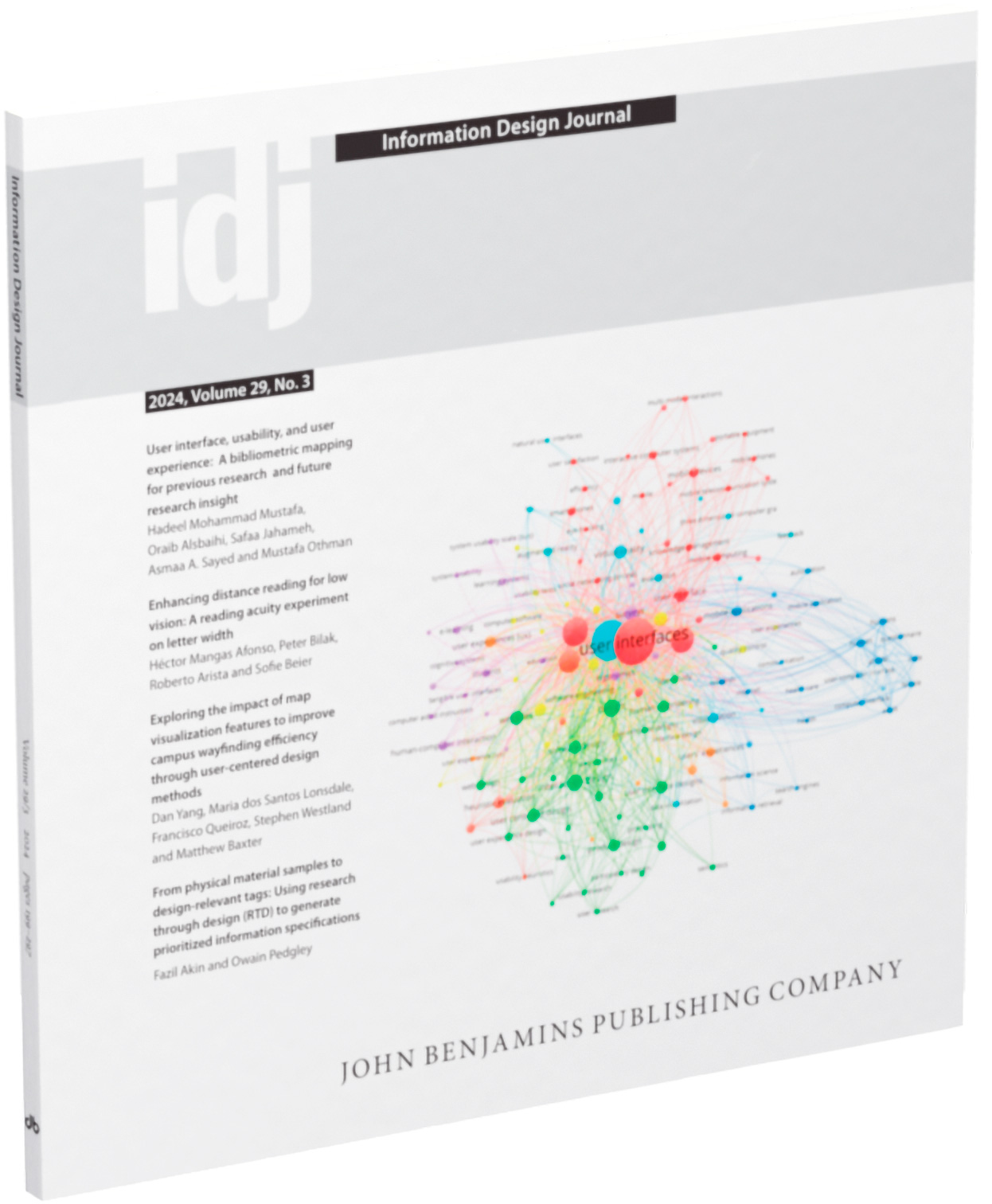
Our book review of Scott Stowell’s book Design for People has been published in the Information Design Journal, 29(3), 2024. November 2025.
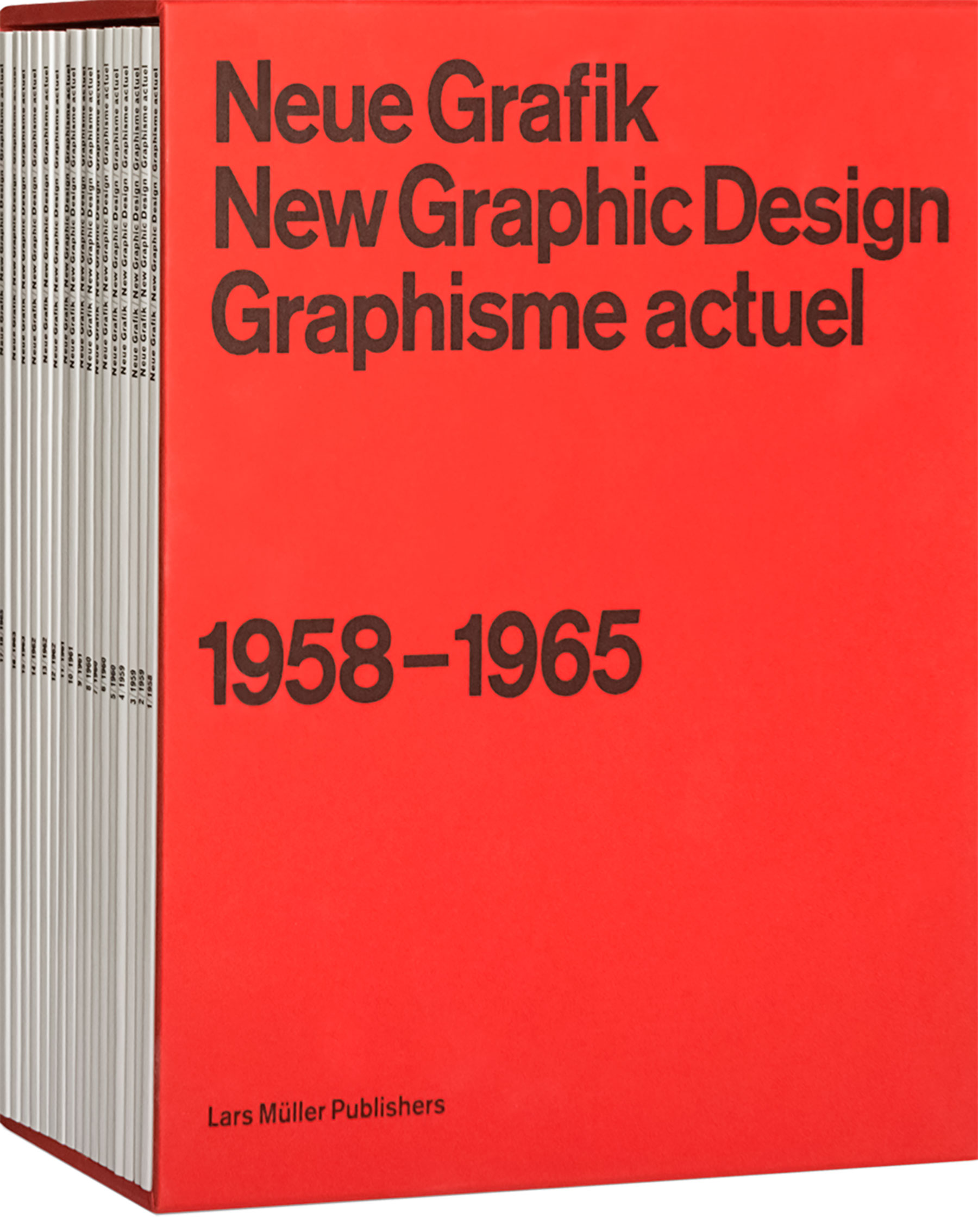
New article Observations on the New Graphic Design 1958–1965 Journals by Josef Müller-Brockmann, Richard P. Lohse, Hans Neuburg and Carlo Vivarelli (And Others)
Our monstrous full length journal review titled Observations on the New Graphic Design 1958–1965 journals by Josef Müller-Brockmann, Richard P. Lohse, Hans Neuburg and Carlo Vivarelli (And Others) is available to read on our Medium.
There is also a very short post about it on our Behance, and if you liked that check out our The Best Dutch Book Designs 2017 book review. July 2025.
New article Observations on the New Graphic Design 1958–1965 Journals by Josef Müller-Brockmann, Richard P. Lohse, Hans Neuburg and Carlo Vivarelli (And Others)
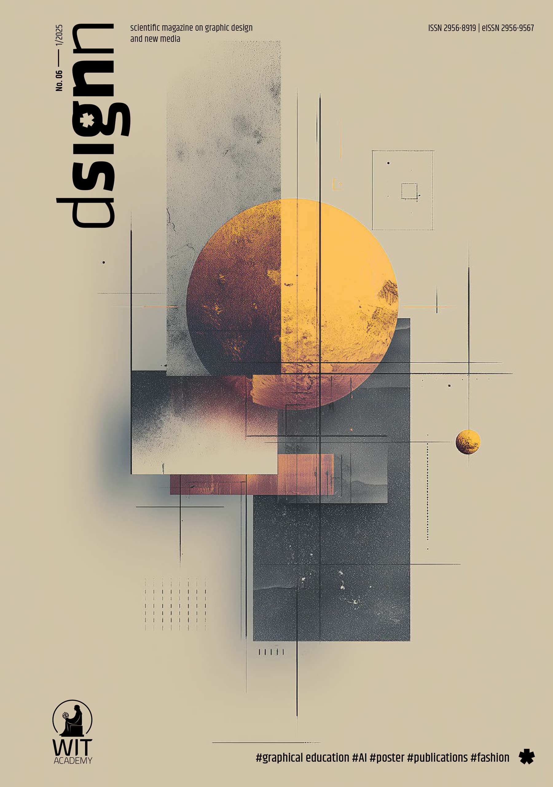
A short version of our monstrous journal review titled Observations on the New Graphic Design 1958–1965 Journals by Josef Müller-Brockmann, Richard P. Lohse, Hans Neuburg and Carlo Vivarelli (And Others), has been published by the Polish scientific magazine on graphic design and new media, dsignn. The review is on pages 76–83 of the PDF, of issue 6, 2025. The full version will be available soon. June 2025.
New article The Role of Illustration Style in Visual Storytelling
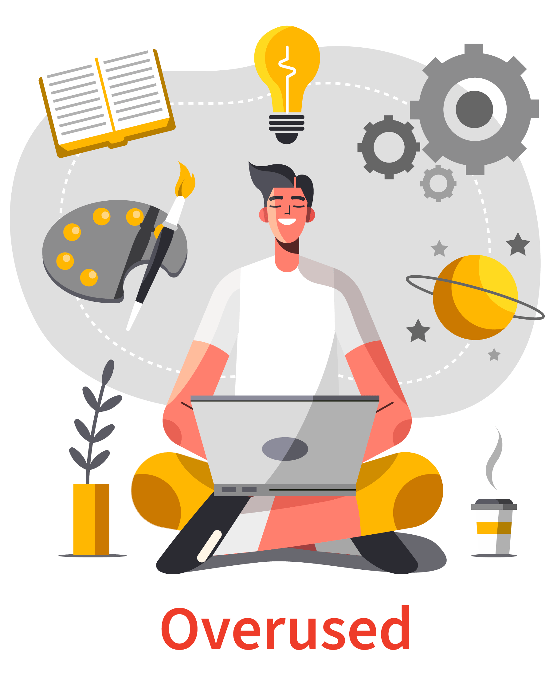
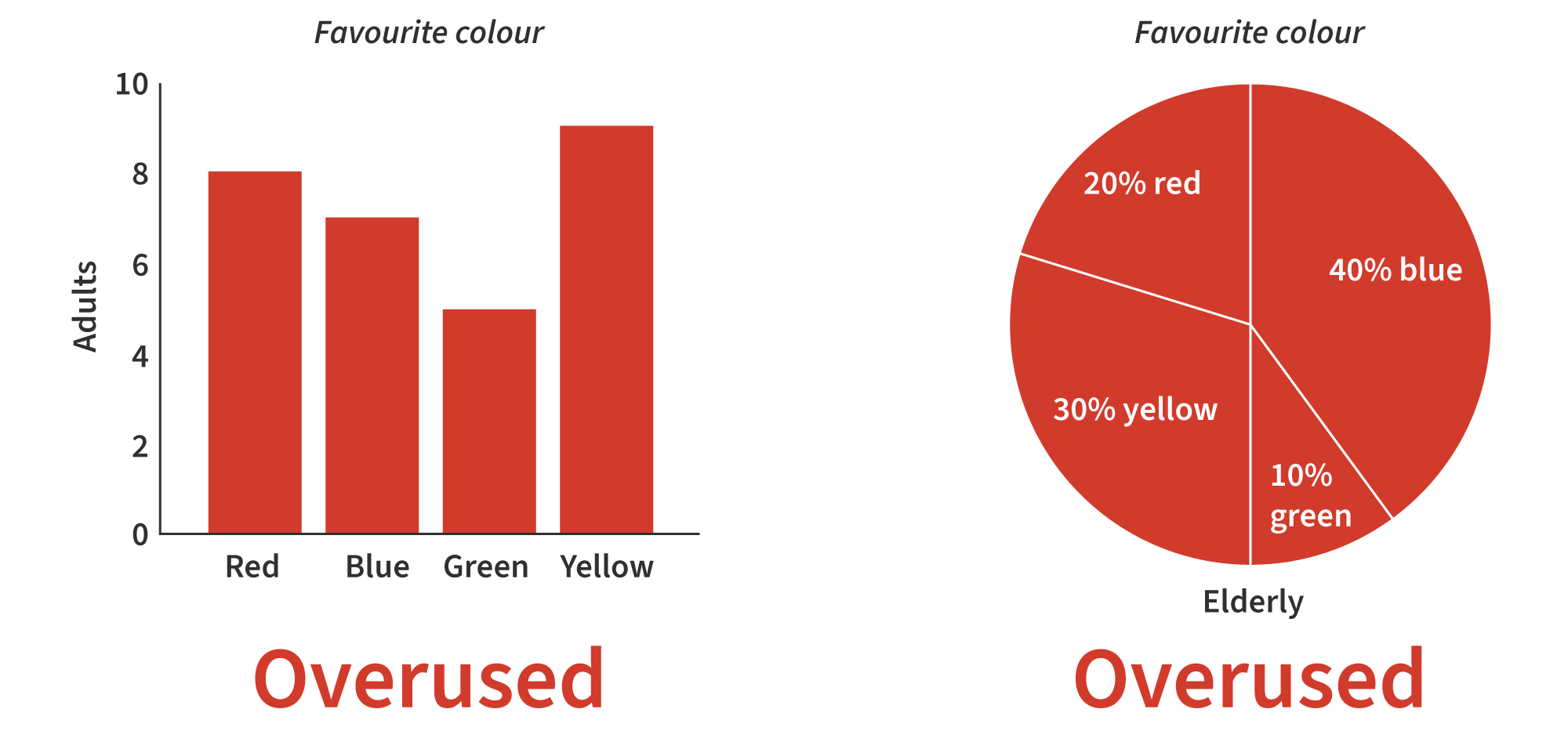
We have written a new article titled The Role of Illustration Style in Visual Storytelling. Flat clean vector illustration is so overused (as is shown). Thanks to Yana Kirilenko and Alma Hoffmann. January 2025.
New article Alternatives to Typical Technical Illustrations and Data Visualisations
We have written a new article titled Alternatives to Typical Technical Illustrations and Data Visualisations. Bar and pie charts are so overused (as is shown). Thanks to Yana Kirilenko and Alma Hoffmann. November 2024.
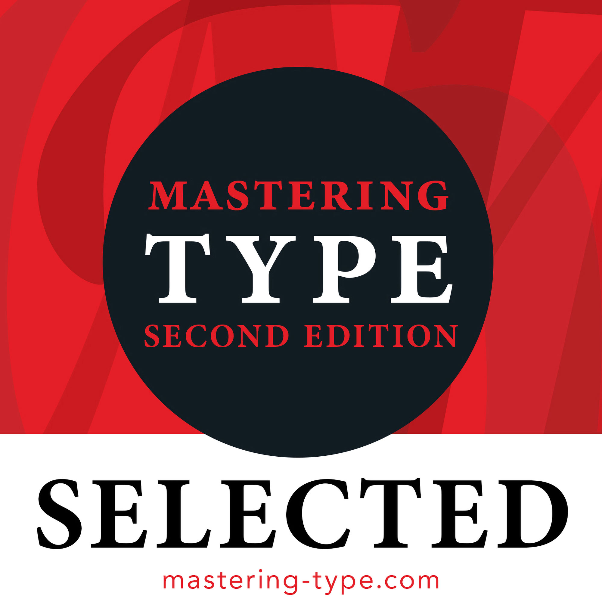
Our work selected and published in the 2nd edition of the Mastering Type book
Our work has been selected for publication in the 2nd edition of the Mastering Type book from Bloomsbury Publishing and mastering-type.com.
Amazing typographic design works were submitted during the open call, making the awards decision‑making process challenging. There were 272 designs selected from 2005 submissions. The final book is globally represented by designers from 36 countries, all managed by Denise Bosler (professor, designer, letterer, illustrator, and author). April 2024.
‘We All Have Our Little Things…’ (Liz) […] paper
We should not be scared to tackle and discuss the more delicate and tricky issues of society and of human living… But it is not always easy… Yes difficult issues come with a certain amount of not knowing, fear, and wasted energy (but that is what the problem is in the 1st place).
Read our paper ‘We All Have Our Little Things…’ (Liz) and Our Art of Health Global Competition Entry for STI & HIV 2023 on our Medium. About us trying to do more edgy, difficult and challenging design projects, as well as still offering our range of other services. Zbohom (goodbye in Slovakian). April 2024.

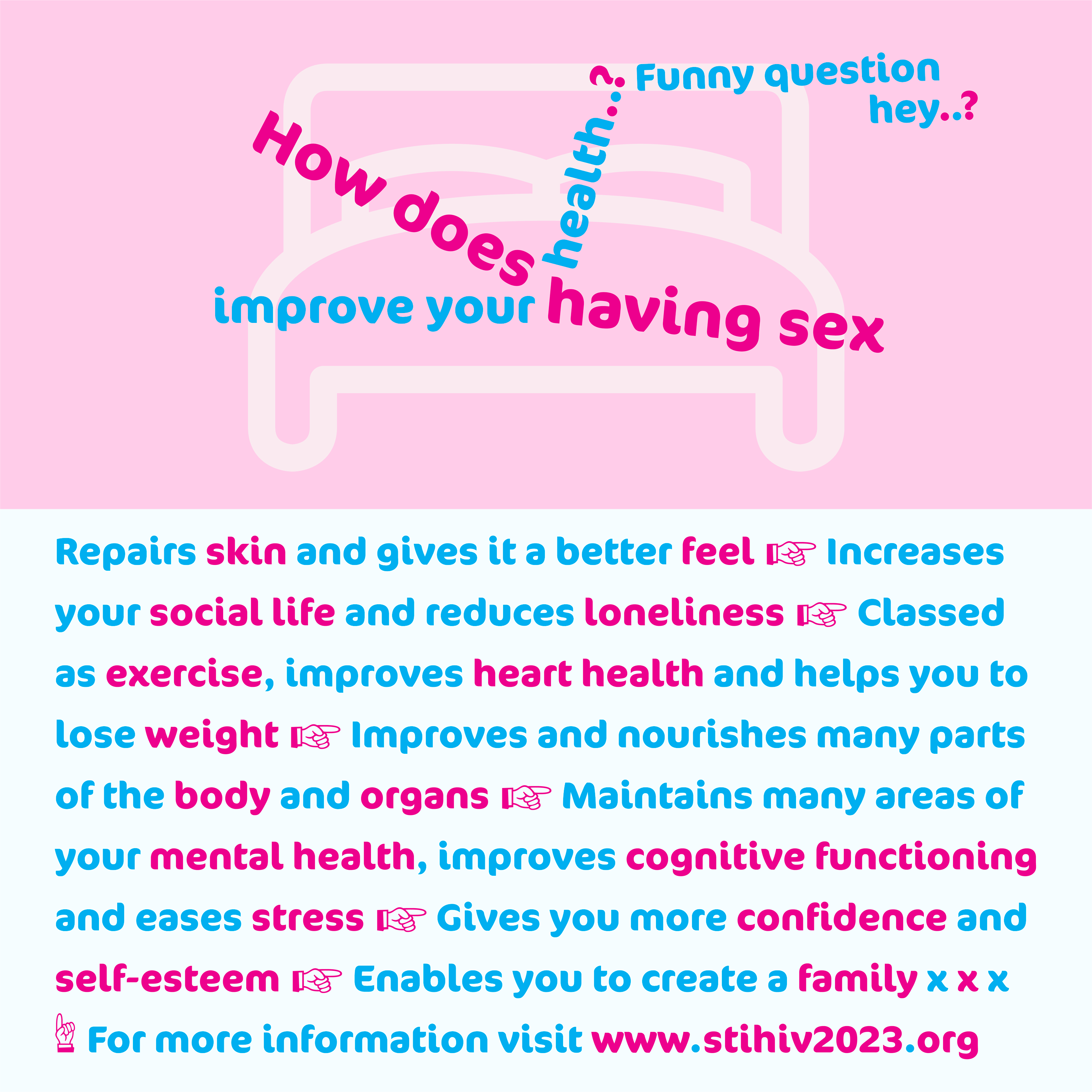
Art of Health global competition entry for STI & HIV 2023
We have decided to showcase our submission for the American Sexually Transmitted Diseases Association Art of Health, to answer the question ‘what does sexual health mean to you?’.
We have decided to allow copyright-free reuse of this graphic communication design submission, but you must always credit: Graphic communication design by User Design, Illustration and Typesetting www.userdesignillustrationandtypesetting.com.
We would also like to class it, as a specific piece of health information design www.healthdesignnetwork.net and government campaign design work. April 2024
Effectiveness request of the awarded redesigned disability pictogram winning entry…
In December 2023, we got an email from The International Union of Architects (UIA) and Rehabilitation International (RI) who jointly invited submissions in 2022, for a 21st-century symbol of accessibility, to represent their core values of rights and inclusion, independence, physical and virtual accessibility for all, including people with disabilities. The intent was for the new symbol from the competition, to replace the person in a wheelchair pictogram.
So in May 2022, we submitted a design along with user testing results. After a delay of 3 weeks after the original winners’ announcement date, we were not successful, our submission did not get an award. We said the following about the top-3 pictogram designs awarded ‘not good’. We were not keen on the awarded design and did not know what it was…
So in December 2023, we got an email from them once again saying ‘It is important to note that whilst this new symbol has been proposed to the Public Information Symbols, Signs and Guidance System (ISO/TC 145/SC1) (International Organisation for Standardisation, 1970) documentation, it has not yet been accepted and the views of key stakeholders, are being invited on this important issue. To that extent the Guild of Architectural Ironmongers (GAI) and Graphical Symbols – Public Information Symbols (PH/8/2) (The British Standards Institution, 2023) documentation, would like to ascertain the thoughts of industry, by requesting responses to the following questions’. We will save you the work of reading the 13 electronic form questions about the new amazing pictogram design. But they are very unsure about the design itself, and are not sure if it even works or is good… So I think I have said enough, I replied to the form, and at the end I wrote ‘why not use our design that we submitted and read the user testing results?’. Anyway, I think you get the idea. If you employ people who do not really know what they are doing, it never goes very well and is more open to problems (people have known this for 100s of years).
Competition board
The competition board cannot be told either (they think they know best and know better than designers or users). In fact, this is not even the point, the point is if a large range of people, like, can use, and can understand the new symbol. The competition board show a lack of intelligence, and they will not have their information and beliefs contested, maybe they enjoyed judging the competition so much, that they want to do it all over again? But there is no need, as they have our entry and many other good ones… When someone cannot be told, they might not like what they hear, or they might disagree, this may be the case, but if you cannot be told, you do not learn anything, or possibly know about something you might be doing wrong, or could be done better. The competition board chose a design based on their subjective preferences, it gives them a sense of input and value, but the mistake is they usually have no expertise in the area and they only choose to reinforce and value their singular narrow vision, but the new pictogram will be used by millions of people. Maybe they simply disagree from their comfortable and luxurious position, maybe their disagreeing, is the incontestable de facto that should never be looked at and simply is… but it would seem not now. Maybe they are scared of an alternative to their grand subjective personal incontestable utopian ideologies. If only they were given a disability or put in the position of a person with disabilities, stripped of their goods, wealth, position and supplies, only when it becomes a reality, are they denied their indestructible castle with a moat. They expect change, insist on change, they demand change, they think they have a right to change, they want a say and to direct constitutional reform, but unfortunately and there is an almighty unfortunately… they will not have their own constitution reformed (oh no, and most certainly not, how could it possibly be wrong and have faults…). They promote, but they do not do what they promote. There are even some that do all that is asked and required, but that have their value robbed and misdirected… and this is 1 of the worst ones out there, but it happens more than you might think, but they will not always tell you. It all becomes very silly, until in the end, you find out what really matters, power and value. The person who has the power and value, survives, at least in a Western society anyway. The people with power and value are also stronger, by default than people with less power and value… The underdog has already started difficultly with an increased amount of failure from the start, on their utopian quest, of an unknown size (but maybe that is what the people with power and value really wanted in the 1st place, but did not reveal).
We ourselves do enjoy the view from ground level, free to go wherever but not without a certain amount of automatic problems. But a castle with a moat, would be a nice objective reality. Then we could fire-off a few cannonballs and delete some of our problems, without being burnt or hit, hopefully destroying some of the bozo corporations. Anyway, it is all fairly typical stuff, and we are certainly not surprised. But it does become a little degressive year-after-year.
This scenario reminds us of our old, and he would not mind, Australian colleague David Sless, director of the Communication Research Institute. We wonder what he would say, although he probably has many copies from years and decades gone by, but probably enjoys fig rolls and cigars more these days in the hot sunshine.
So we have done our bit (and free of financial charge, for goodwill and public good) and that is it. We were not surprised at the concerned request for information about the effectiveness of the newly awarded pictogram, but it does insult and devalue our work. Charlotte Armstrong in 2023, in her article Replacing the Accessibility Symbol – What Is Happening and How to Get Involved (Armstrong, 2023) has also arrived at the same grand discovery.
Few knowns in communication, but it does not mean we should not try to find out, and there are many ways of doing so, massively developed in the last 10–20 years. We must never assume communication or more specifically graphic communication will go well, as is expected or intended, it is a very faulty belief. And when you add political difficulty to the equation, you might as well put your sprinting shoes on.
The surprising thing is, that we still cannot work out, is how they arrived at a very bad awarded pictogram. That they then need more information on, because it is so highly unusable and unsuccessful. They have had 100s of entries including ours, all with the required user testing data (naturally), and they still do not have something that works and can be used… We do not understand it and is highly frustrating, stupid and insulting to human intelligence. Should we have even bothered.
And there is another issue that has been genuinely overlooked but that should not. The final awarded winning new pictogram design, has to be submitted to the International Organisation for Standardisation (ISO)… so they do not even know for sure, if the winning pictogram design will be accepted… This is a difficult area and we are not blaming them about this issue, but maybe they could have submitted some designs, like 3 designs to the International Organisation for Standardisation (ISO), then at least there should be something half usable for them to do something with?
The newly awarded pictogram design in 2022 by Ukrainian architect Maksym Holovkoas, to replace the person in a wheelchair pictogram.
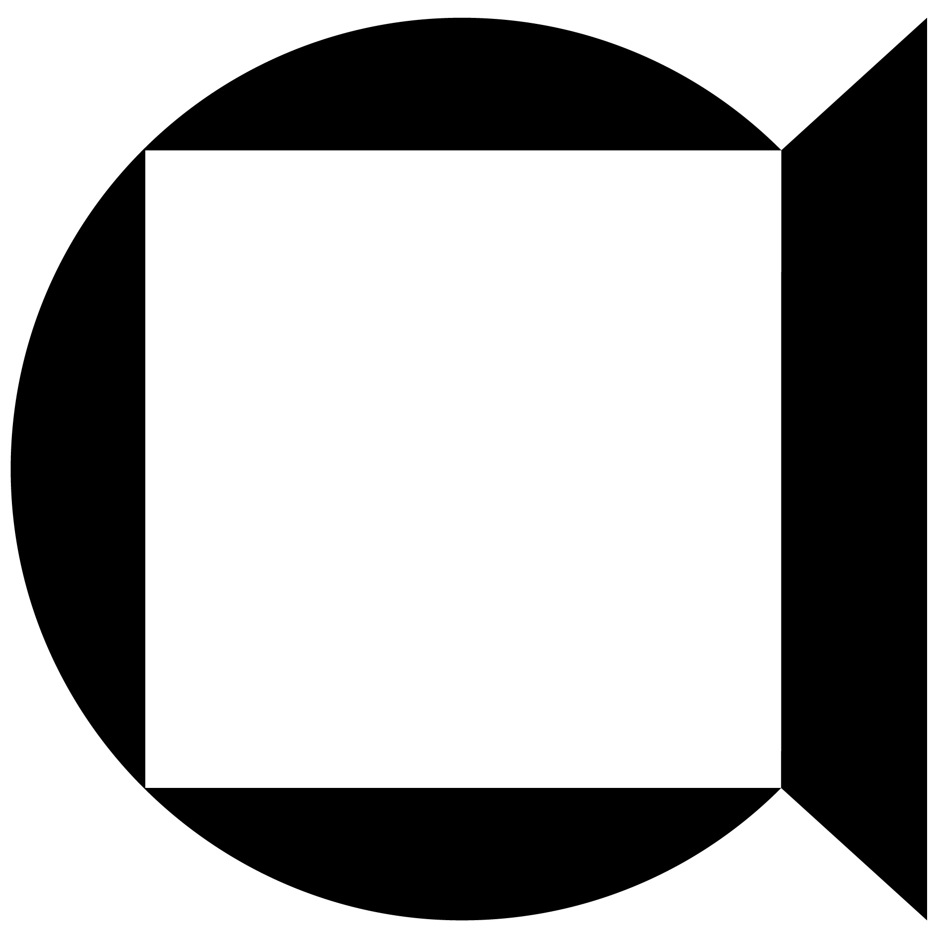

Find out more about our competition entry, on our Information Design webpage. February 2023.
References
- International Organisation for Standardisation (ISO). (1970). ISO/TC 145/SC 1, Public information symbols, signs and guidance system. https://www.iso.org/committee/52662.html.
- The British Standards Institution. (2023). PH/8/2 – Graphical Symbols – Public Information Symbols. https://standardsdevelopment.bsigroup.com/committees/50002556.
- Armstrong, C. (2023). Replacing the accessibility symbol – what is happening and how to get involved. Locksmith Journal. https://www.locksmithjournal.co.uk/replacing-accessibility-symbol-happening-get-involved.
Photographing books… with Justina Nekrašaitė (The Book Photographer) from Amsterdam
So many problems today, maybe even more than in previous years. But never has there been so many opportunities and solutions… But they rarely get to where they need to. To speak to someone or people, who listen, consider, value and ask about what you are saying and doing, is a very rare thing these days.
Here at User Design, Illustration and Typesetting we are focused on delivering solutions every day of the working week, we have to listen to the client, read the brief, solve problems, decide upon ultimate solutions, speak to people involved, deliver and implement solutions, find out if users are okay and if things work well, if they have had a good user experience. And we also have to check if there is enough money in our pockets, so we can do the things we need to. We try not to reject what people say, we try not to assume, we try not to implement mandatory forced solutions, and here is the big 1, we try to always run things by our clients, to ask, to show, to tell, to explain, to discuss, to debate (and we are not going to tell you why we do this). David Sless, director of the Communication Research Institute says:
‘Out of this work, we are creating the tools and methods for a new design profession, which is displacing traditional graphic design and its concern for physical presence. The new profession of information designers transcends the physical and goes to the heart of the functional information needs of an organisation, creating powerful systems that simultaneously shape whole classes of information for workers, consumers and citizens. As a profession, information designers are driven by a desire to make information accessible and usable to ordinary people, and their work lends a quiet dignity to the objects of ordinary life.
It is my firm conviction that we need to stimulate the growth of this profession of information designers if we are to ensure that information becomes something of value in our society, and not a burden’ (Sless, 1995).
And the important part that I would like to requote, is a designer’s ‘work lends a quiet dignity to the objects of ordinary life’. Sounds boring and bland, does it not?, however very desirable for everyday efficient functioning, and when a designer’s work does not lend to a ‘quiet dignity to the objects of ordinary life’, you will sure as hell notice it and know about it (it has another name dysfunction).
Customer service at physical banks in the United Kingdom
We went to a physical bank last week, and we went to the 1st account machine, put our card in, typed in the number, went to print a statement, pressed print, only to be told by the machine, that it was out of paper… A few minutes earlier, I had to cycle all the way across Leicester city, because the original bank I wanted to go to (same banking branch), had shut down in the last month (even though it said it was open, on the Google search side panel opening times information). Luckily and thankfully, the 2nd account machine (there are 3 side‑by‑side in the physical bank), had paper in… Standing behind me, were 3 of the bank’s staff with iPads in their hands. They cannot even check if a machine has paper in it. There could have been a long queue on the other machines. So maybe there is a divine being out there. Maybe the mass media and large corporations have got it right, maybe we should do away with physical shops, as customer service, is not what it used to be. In countries like Switzerland and Germany, if bad customer service happens, the offender gets a really bad look and frown, with possible loss of life (in a manner of speaking, of course). Yes I am not kidding, these countries do not tolerate it. In the hotel and sommelier industry, customer service is serious business. Anyway, onto the point of our news post.
Photographing books
We have photographed most of the printed books on our website, although it is quite a difficult and tricky task. If you are an amateur or even intermediate, or do not have the right equipment, it can be a difficult and time‑consuming task, as we have found out over the years. In fact, it is more work than you might think. Light, getting the book flat, focus sharpness, shadows, and getting the correct colour and exposure, are massively time-consuming and difficult tasks. To do it well, you need your own known setup that works. And on more than 1 of our photographing book projects, we have had to completely reshoot, because we have got photographs (that we think are good and correct) back into the computer, then started to go through them, to realise they are not quite right, and need reshooting, all over again. That is right, on more than 1 occasion, we have had to reshoot projects. When you photograph books, the colour contrast is quite narrow (thin), because of this, you need to get it even more correct and how it should be, and done inside the camera (top tip!).
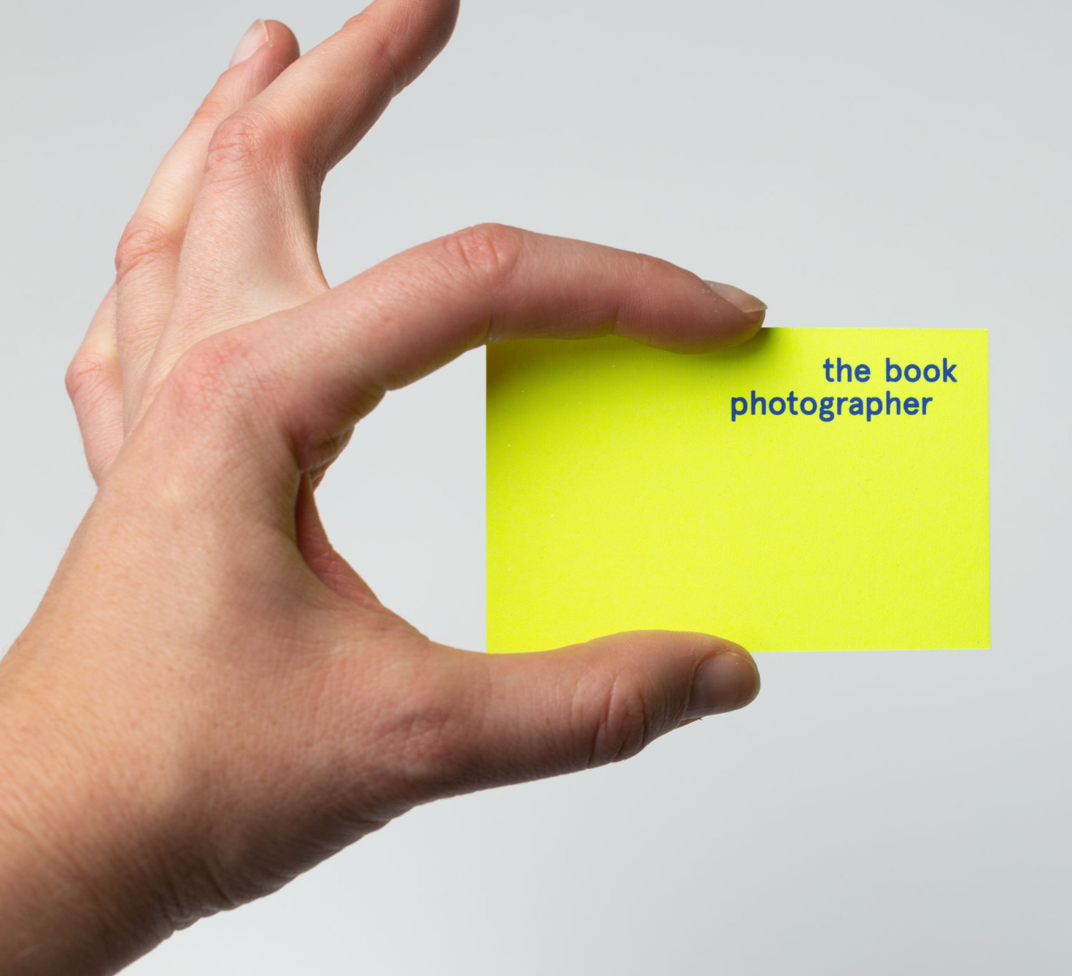
© Justina Nekrašaitė (The Book Photographer), view her portfolio website, Instagram and LinkedIn.
Photograph from photoshoot © Justina Nekrašaitė (The Book Photographer), view her portfolio website, Instagram and LinkedIn.
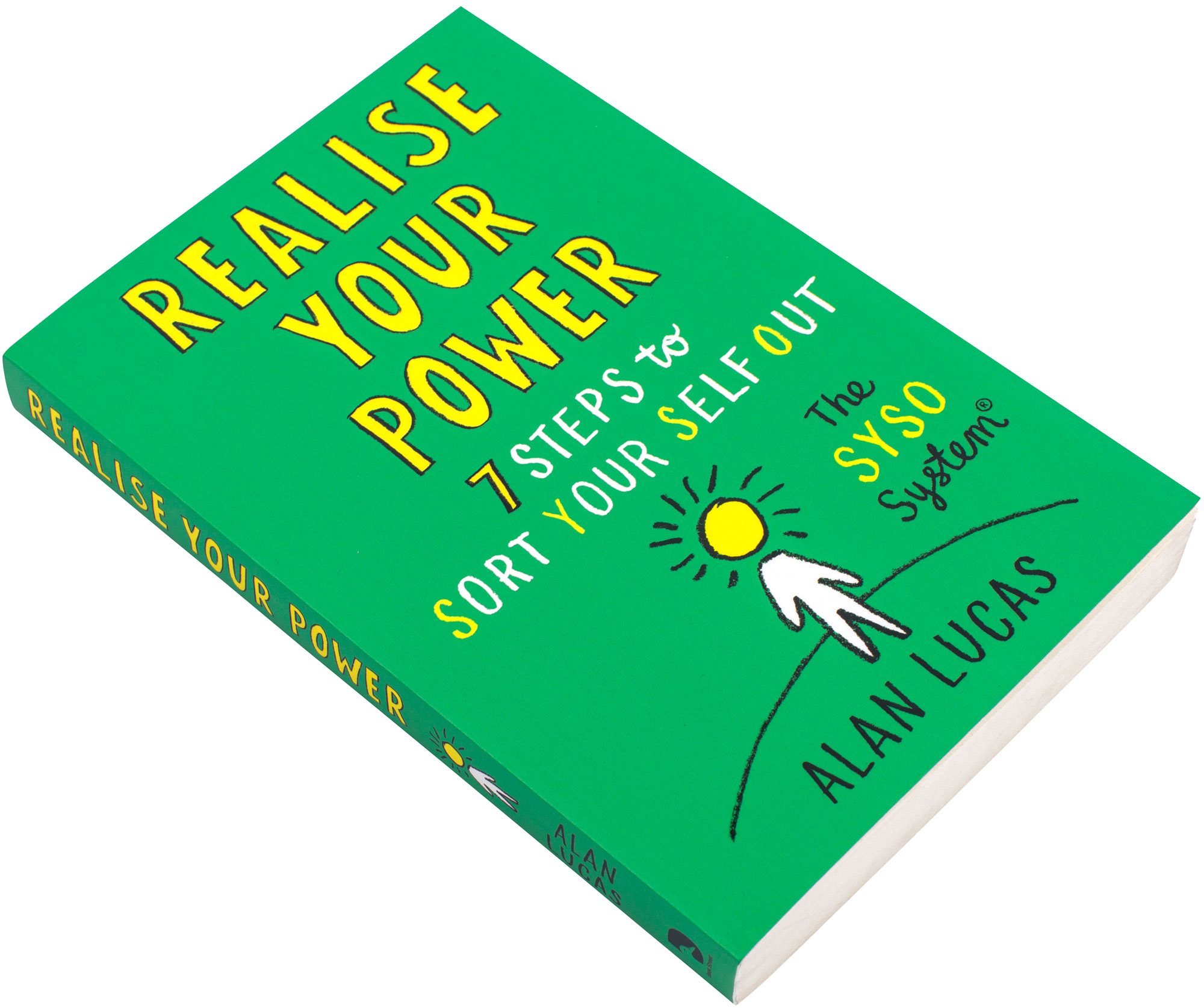
We worked on the book design, illustration, typesetting and amending editorial corrections of Alan Lucas’s Realise Your Power (Lucas, 2023) book, published in 2023 by Whitefox, that went really really well (in fact better than well, we are delighted with the end results). The book is essentially a standard paperback book, as seen in bookshops, and helps you ‘sort your self out’, get motivated, find possibilities and make progress. Some people say they do not like self help books. Well… the bottom line is that they help people, people get something from it. I would say that is that. The cover paper is nice and supports the book, the paper grain of the inside paper actually goes in the right direction (vertically up and down the book’s spine), our design is very unusual in the sense that it was accepted and approved (it has a very nice fun feel and is easy-to-use). The book was printed by Clays, Suffolk, United Kingdom, Elograf, S.p.A.
The problems around photographing books
We thought about photographing the book ourselves, it is more tricky than usual, because of the book’s smallish pocket-size. The issue is getting the outer edge of the spreads to lie flat, and not fold back in and shut the open book. It does this mainly because of the hot‑melt glue (Kinross, 2007) (perfect) binding, that glues the pages (left side of the book block) onto the spin, to near concrete strength. So, 1 of the things that you have to do, is slightly flatten the open spread, then get some special sellotape that peels off easily, so it does not stick harshly to the paper (that would then rip when you pull it off), to make the outer edge pages stick to the table. So you can photography the pages flat (well as near flat as you can get, and yes it does sound complex and difficult, and that is because it is). I am even tired now describing this, and we have not even started to photograph the pages… Larger art, architecture and design books, are easier to photograph, because the page size is larger, that allow double page spreads to open flatter. These types of books, typically use less ridged binding than holt-melt glue, or they are hardback sewn bound, or they use a binding method such as otabinding.
So to cut a long story (and job) short! … … … we found out about Justina Nekrašaitė (The Book Photographer) based in Amsterdam a few years ago, from the Best Dutch Book Design competition yearly annual, and we really liked what she was doing. We had a meeting with her on the 5 February 2024, then commissioned her to photograph Alan Lucas’s Realise Your Power book, published in 2023 by Whitefox, that we worked on. Interested of course to see the results, and to make our life easier and to free-up time. We booked the project in, paid, arranged a meeting to go through the project brief, chatted a bit, explored issues in our professions and with the project. There is no doubt, this book photography project is a dirty job project, and we were more than happy for Justina Nekrašaitė to sort it out.
Thanks also to Alan Lucas and Whitefox for permission to allow us, to shoot photographs of the book. We will write-up the project and add the other photos soon, and put on them on the Book Design webpage.
Tot ziens (goodbye in Dutch). February 2024.
References
- Kinross, R. (2007). Books that lie open. Hyphen Press. https://hyphenpress.co.uk/books_that_lie_open/.
- Lucas, A. (2023). Realise your power. Whitefox.
- Sless, D. (1995). Information design for the information age. Communication News, 8(5/6).