Typographic communication is a major part of graphic communication, most websites are made-up of about 75% text. It enhances and optimises graphically visible language, improves the way you communicate and are perceived, creating a professional appearance, making graphic language easier for people to use and process. We help clients create a good typographic appearance, feeling and voice, to improving legibility, plus offering expert advice. We also do academic typographic design research and our papers have been published in Baseline Magazine, Information Design Journal, Typography.Guru, Slanted and Smashing Magazine (see our News, Awards, Writing and Ideas webpage for more information). Typography enhances user motivation levels and is no typo.
Complex information rich times and environments
We can help you with
- Legibility at small, medium and large sizes.
- Increase the appeal of text for different categories of people.
- Text economy issues, for example in dictionaries, or on signage in the environment.
- Typographic design for general, children, dyslexic, vision impaired and ageing readers.
- Micro-typography (justification, kerning, leading, tracking, hyphenation, superscripts/subscripts).
- Choosing and combining 1 or more different typefaces.
- Heading structures and hierarchies.
- Equations, mathematical and scientific symbols.
- Multilingual texts (Cyrillic, Greek, foreign languages).
- Hand-lettering.
- Using typefaces to achieve a branding, tone, character, or feel.
Below is a selection of projects to give you an idea of just some of the projects we have worked on.
Client
Typography.Guru.
Project title
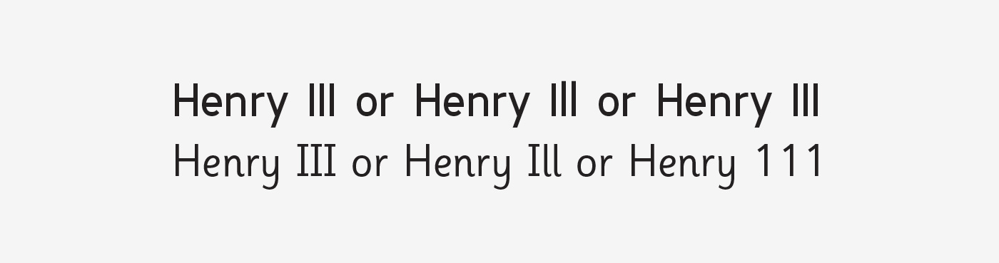
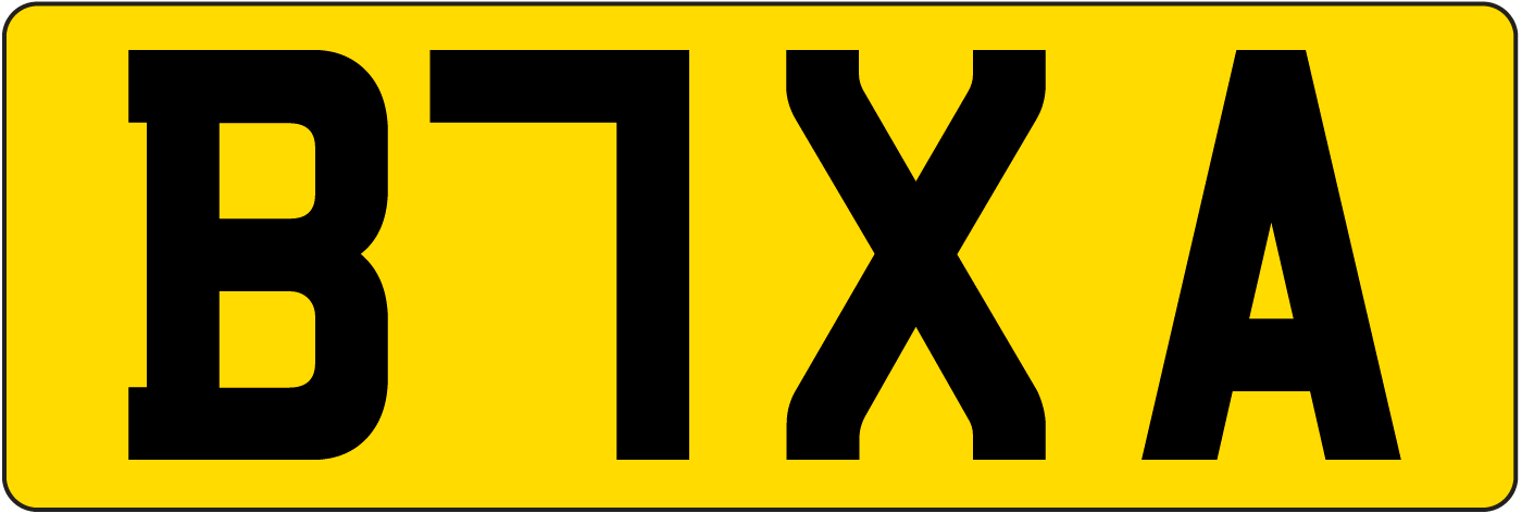
Letter and symbol misrecognition in highly legible typefaces for general, children, dyslexic, visually impaired and ageing readers.
Services
Typographic designAcademic research.
Link to paper
About the client
The number 1 typography hub on the internet where you can learn about typography.
Outline of what we did
This paper is an extensive exploration into precise aspects of legibility, specifically letters and symbols that are not easily recognisable and that look similar to other ones. Legibility is a very fine, narrow and microscopic issue and the smallest of slight changes to a letter’s or symbol’s design, can have a vital impact. The paper and research is not meant to constrain and make typeface designs generic, but to improve typeface designs and further increase legibility. The aim is to make typefaces work even better.
The paper has been edited and updated around 8 times, and published in 5 places over a 10‑year period, that had a large beneficial impact.
Paper editions
- Bohm, T. (2012). Letter and symbol misrecognition in highly legible typefaces for general, children, dyslexic, visually impaired and ageing readers. Baseline, 61. http://www.baselinemagazine.com/browse_buy/magazine/back_issues/61/.
- Bohm, T. (2012). Letter and symbol misrecognition in highly legible typefaces for general, children, dyslexic, visually impaired and ageing readers. Slanted (Signage/Orientation), 18. https://www.slanted.de/beitrag/slanted-18-signage-orientation/.
- Bohm, T. (2013). Letter and symbol misrecognition in highly legible typefaces for general, children, dyslexic, visually impaired and ageing readers. Hiut, 4(2).
- Bohm, T. (2014). Letter and symbol misrecognition in highly legible typefaces for general, children, dyslexic, visually impaired and ageing readers. Information Design Journal, 21(1). https://benjamins.com/catalog/idj.21.1
- Bohm, T. (2015, December 2). Letter and symbol misrecognition in highly legible typefaces for general, children, dyslexic, visually impaired and ageing readers [1st edition]. Typography.Guru. https://typography.guru/journal/letters-symbols-misrecognition/.
- Bohm, T. (2016, October 9). Letter and symbol misrecognition in highly legible typefaces for general, children, dyslexic, visually impaired and ageing readers [2nd edition]. Typography.Guru. https://typography.guru/journal/letters-symbols-misrecognition/.
- Bohm, T. (2018, February 5). Letter and symbol misrecognition in highly legible typefaces for general, children, dyslexic, visually impaired and ageing readers [3rd edition]. Typography.Guru. https://typography.guru/journal/letters-symbols-misrecognition/.
- Bohm, T. (2019, May 1). Letter and symbol misrecognition in highly legible typefaces for general, children, dyslexic, visually impaired and ageing readers [4th edition]. Typography.Guru. https://typography.guru/journal/letters-symbols-misrecognition/.
We have started to see the research and issues explored in the paper, in new typeface designs from about 2018 onwards, and especially in custom designed typefaces for organisations like IBM (IBM Plex), Netflix (Netflix Sans), BBC (Reith), YouTube (YouTube Sans), Goldman Sachs (Goldman Sans), and Amazon (Amazon Ember). The paper also informed best practice accessibility research and guidelines published by the Association of Registered Graphic Designers in Canada (RGD) (2019). We would like to thank everyone who has commented and referenced to the paper, both academics, practical designers and on social media. Below is a selected list of places the paper has been referred to, and 2 interviews about the work, with Steven Heller (2016) and Sarah Dawood (2015).
Selected publications and work that use the research
- A11Y Project. (2023, June). Resources. Typography. https://www.a11yproject.com/resources/.
- Association of Registered Graphic Designers (RGD). (2019). AccessAbility 2: A practical handbook on accessible graphic design. (p. 25). https://www.rgd.ca/database/files/library/RGD_AccessAbility2_Handbook_2019_06_01(1).pdf.
- Bruce, L. (2021, September 8). What makes a good, accessible, easy to read font? https://gathercontent.com/blog/what-makes-a-good-accessible-easy-to-read-font.
- Commonwealth of Australia. (2023). Australian Government style manual. https://www.stylemanual.gov.au/grammar-punctuation-and-conventions/numbers-and-measurements/choosing-numerals-or-words.
- Dawood, S. (2015, December 11). Can you tell your 1 from your l? Why letter legibility is key in type design. Design Week. https://www.designweek.co.uk/can-you-tell-your-1-from-your-l-why-letter-legibility-is-key-in-type-design/.
- Heller, S. (2016, October 24). Daily Heller: Type for impaired eyes. Print Magazine. https://www.printmag.com/post/type-for-impaired-eyes-published-punctuation.
- Hicks, J., Wall, E., Shelly, Z., Jones, P., Burch, R., & Reimann, W. (2019). Signal detection in American football play calling: A comprehensive literature review. Cogent Psychology, 6(1). https://dl.acm.org/doi/10.1145/3366423.3380243.
- McCoy, E. (2018, May). Accessible web typography for the visually impaired (pp. 22–23) [Doctoral dissertation, University of Baltimore]. https://mdsoar.org/bitstream/handle/11603/10871/Accessible-Web-Typography_EMcCoy.pdf.
- White, M. (2021, February 1). DI&B reading list. https://blog.mollywhite.net/dib-reading/.
- Yangyu, H., Wang, H., He, R., Li, L., Tyson, G., Castro, I., Guo, Y., Wu, L., & Guoai, X. (2020, April 20). Mobile app squatting [Conference presentation]. WWW ’20: Proceedings of The Web Conference 2020. https://dl.acm.org/doi/10.1145/3366423.3380243.
There have been 4 editions of the paper published on Typography.Guru. Between the 1st edition on the 2nd December 2015, and the 4th edition on the 1st May 2019, it has been read more than 63,000 times and we are delighted.
3 main improvements for them
- Improved the design, legibility and performance of typefaces for general, ageing, dyslexic and vision impaired readers.
- Improved international typographic legibility standards.
- Increased typographic accessibility, usability and inclusive design knowledge for a wide-range of people and abilities.
‘Can you tell your 1 from your l?’ (Sarah Dawood, Design Week)
Client
Friends of New Walk.
Project title
Website redesign.
Services
Website designText editorial standardisationInformation designWrite of website accessibility statementPhoto editingTypographic design.
Website
About the client
Charity that effectively monitors and influences the future of New Walk, Leicester’s historic walkway in the city centre.

Outline of what we did
This project is a good example of what good typographic choice and design can do, and offers graphic communication. We originally researched and proposed 4 different typefaces for the website design project, and for the client to choose from. In collaboration with the client, a final medium weight typeface was chosen, because screen resolutions and devices vary so much today, even different internet browsers and computer operating systems all render a typeface in subtly different ways. If we had of chosen a regular or light weight of the typeface, there would have been real risk of the typeface in some electronic environments, rendering too thin (bold is better than too thin). The typeface chosen relates to the client’s content and purpose, reflecting what they do and are about. The typeface is also equipped with the necessary features, like common ligatures, small capitals in all weights, and oldstyle numbers. All of this, along with good graphic communication design and relevant use of colour, enriches and improves typographic communication and helps to create an appealing and fitting identity, that is easy‑to‑read making people want to use it. It shows the power and effect that typographic design has. What would the website’s typographic communication, tone and feeling say if a typeface like Arial was used?
3 main improvements for them
- Increased the appeal and perception of the client’s organisation with people.
- Increased typographic legibility on screens and for general and ageing readers.
- Avoided generic, bland and hard-to-use typography.
Related the past and present
Client
Smashing Magazine.
Project title
Micro-typography: how to space and kern punctuation marks and other symbols.
Services
Typographic designAcademic researchJavaScript coding.
Link to paper
About the client
Founded in 2006, Smashing Magazine delivers useful articles to website designers and developers, and is the web’s number 1 online website design magazine, averaging 3 million monthly page views.

Outline of what we did
The paper and research is about issues around micro‑typography in typeface design. Micro-typography is basically white spacing and kerning in typography and typeface design, like microscopic additions or reductions in white space around letters. We read and reviewed around 40 references (books, journals, websites) and discussed the issues within the paper. Before the paper was published, we spoke with and got the paper reviewed by worldwide experts. There is even an interactive real-time figure (see Figure 5 within the paper) so you can see exactly what micro‑typography is and does. Some people say micro‑typography makes no difference and that you should start with a well designed typeface the 1st place (as Chris Coyier mentions in Some Typography Links on CSS Tricks), although things are not so straightforward and simple…
The paper concludes that we need a kerning table edit for Adobe InDesign and basically a kerning table edit for web typography, or a technical option to allow typographers to add space, either to the left or right side, of a letter or symbol.
3 main improvements for them
- Provided recommendations for improving future typographic practice and software.
- Highlighted strengths and weaknesses in previous research and practice.
- Increased typeface designers understanding, knowledge and the benefits of micro-typography.
Gave them macro solutions
Client
Typography.Guru.
Project title
No more new similar typefaces for extended reading, please!
Services
Typographic designAcademic research.
Link to paper
About the client
The number 1 typography hub on the internet where you can learn about typography.

Outline of what we did
This paper seeks to briefly explore the issue of design similarity and usefulness in contemporary typeface design and development. The following issues are explored and discussed:
- New typeface designs and similarity to existing ones.
- What do we need in terms of character and language support.
- Arguments around if we need anymore typefaces.
- Typeface designers doing extension work on existing typefaces.
- The rise of major brands commissioning new custom typefaces.
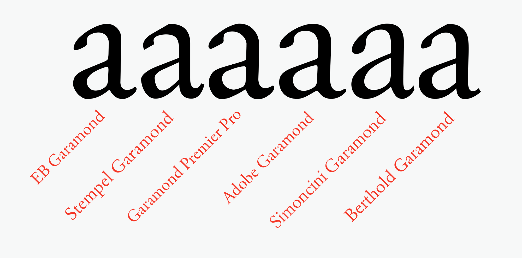
It also showcases examples of ideal practice and concludes that new is not always better, and that we should not forget what has worked well in the past. As of July 2021, it has been read more than 15,000 times.
We have started to see some of the good old typefaces and typefaces directly referred to in the paper, have their character and symbol range globally expanded in recent years, like Helvetica Now (2019), Arnhem Cyrillic (2020), Arnhem Greek (2020), Futura Now (2020), and Avenir Next World (2021). This is very interesting and we are delighted.
3 main improvements for them
- Outlined strengths and opportunities for development in typefaces.
- Highlighted accessible character needs in classic old and new typefaces.
- Showcased highly useful typeface design examples already available.
‘Build on the good and make it better’ (Paul Mijksenaar, Bureau Mijksenaar)
Client
Smashing Magazine.
Project title
Measuring the performance of typefaces for users (part 1), and Measuring the performance of typefaces for users (part 2)
Services
Typographic designAcademic research.
Link to paper
Read part 1 or part 2 on Smashing Magazine.
About the client
Founded in 2006, Smashing Magazine delivers useful articles to website designers and developers, and is the web’s number 1 online website design magazine, averaging 3 million monthly page views.

Outline of what we did
This paper explores the various issues and problems around testing typefaces and how we can measure their performance. What do we are actually looking for when we test typefaces, why it is important to measure. Also the complex and difficult issues around testing typefaces and is it even worth the effort, to issues around what ultimate utopian highly legible typefaces might be like. Is new always better and are we just designing wheels nowadays that already exist? Then to data quality and relevance, to a list of ways to measure typefaces and if they produce subjective or objective data. To finally, the expertise distance between a design approach and a scientific approach. This paper also references to a mass of papers, journal articles, books and academic research. We feel the paper does a lot of groundwork and is quite forward‑thinking and useful for future research.
3 main improvements for them
- Outlined more accurate ways to measure the performance of typefaces.
- Discussed many issues around this difficult and complex area, all in 1 useful place.
- Described what makes bad and good data (the difference between subjective and objective data).
Testing… testing… Can you read me alright?
3 results of typographic design by us
1 Establish your service, product or business clearly, in a professional and legible graphic voice.
2 Communicate better with more people including people with vision impairments, ageing eyesight or dyslexia.
3 Reduced the cognitive demand on readers, due to typographic design that tires them less quickly.
Clarify your ideas, describe your content better and get more of it understood
We make more of a difference than you think! We would like to know more about your project
Contact us